Changelog
Stay up to date with all of the latest additions and improvements we've made to Tailwind Plus.
Oatmeal: Our first multi-theme marketing site kit
We've just released Oatmeal, a beautiful SaaS marketing kit built with Tailwind CSS and Tailwind Plus Elements.
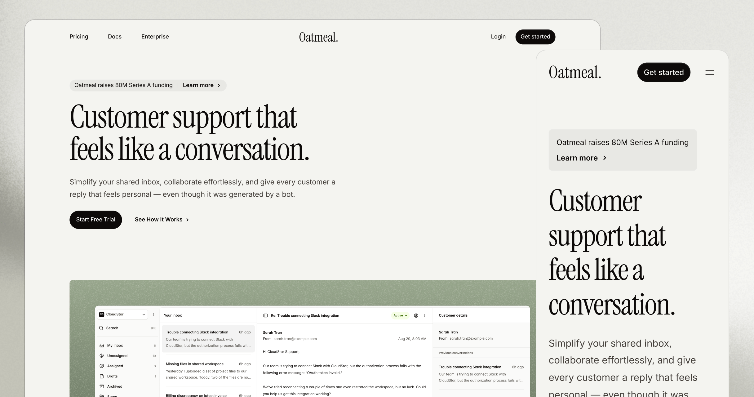
With over 50 components, 100+ icons, four color schemes, and three different font options, this kit is designed to be customizable in a way that a traditional template isn't. Assemble your own unique marketing site by mixing and matching components, or use one of the pre-built example pages to get started quickly.
With a traditional template, you're stuck with a single design that may not easily fit your product or content. Oatmeal gives you the flexibility to create a site that feels truly yours. We've taken great care to ensure that every section is accessible, responsive, and looks great in any combination.
Take a look at the live demo to explore some of what's included, and see just how versatile the Oatmeal kit can be. There's never been a faster way to build a thoughtfully designed marketing website with Tailwind CSS.
Dark mode support for application UI and marketing blocks
We've finally added dark mode support for all of the application UI and marketing blocks in Tailwind Plus.
There's now a picker to toggle between light only, dark only and system modes so you can grab the code for whatever setup you need to support.
We've carefully tuned the colors and visual hierarchy to make sure the dark mode experience feels just as polished as the light mode designs. Now you can give your users the dark mode experience they've been asking for, with the same attention to detail you expect from Tailwind Plus.
Check out the UI blocks to add dark mode to your projects today.
Vanilla JavaScript support for UI blocks
We’ve just added vanilla JavaScript support to the HTML snippets in our UI blocks. This means you no longer need to reach for React or Vue if you want components with full interactivity.
To do this we’ve introduced a brand new UI library called Tailwind Plus Elements, which builds on modern web features like <dialog>, popover, and custom elements. Just drop in a script tag and you’re good to go.

Whether you’re using Rails, Laravel, Svelte, Astro, or plain HTML, you can now use Tailwind Plus components like dropdowns, selects, tabs, popovers, and more, with no extra wiring. Same components, same beautiful design — now framework-agnostic.
To learn more about Tailwind Plus Elements, see our announcement blog post.
Compass: A starter kit for online courses
We've just released Compass, a clean and sophisticated starter kit for publishing your own online course, built with Next.js and Tailwind CSS.
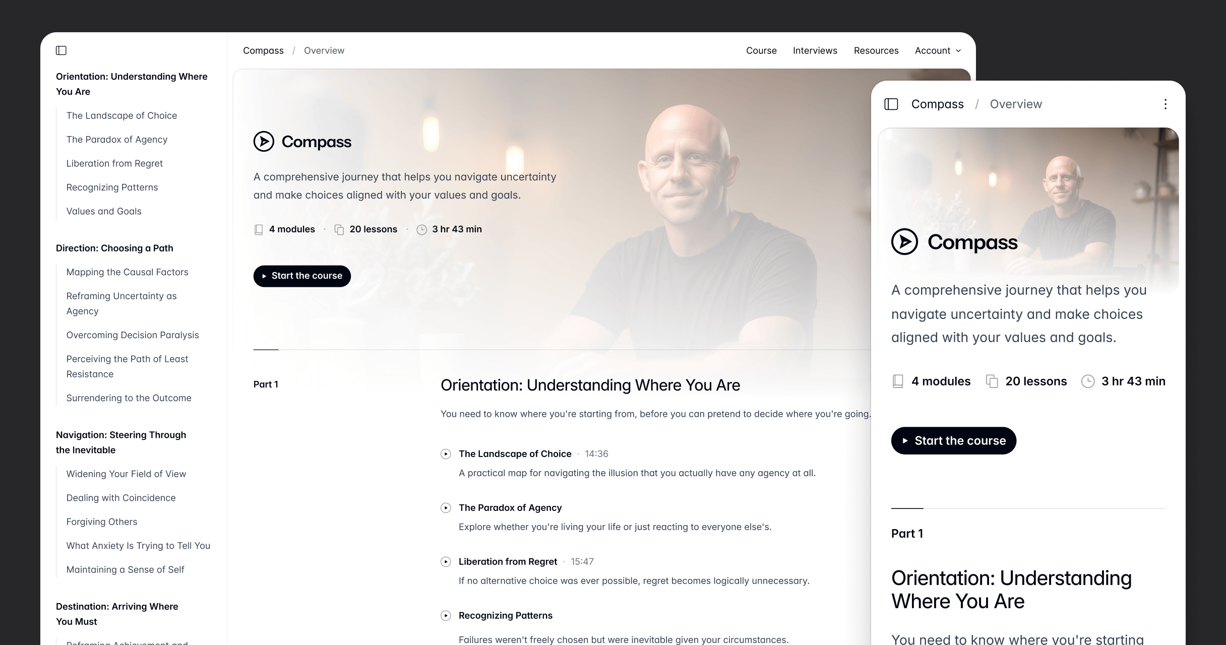
This template includes a bunch of interesting tools and technologies, like picture-in-picture video, parsing VTT files into transcripts, and extending Markdown images for dark mode and layout shift.
You can read more about it in our announcement blog post.
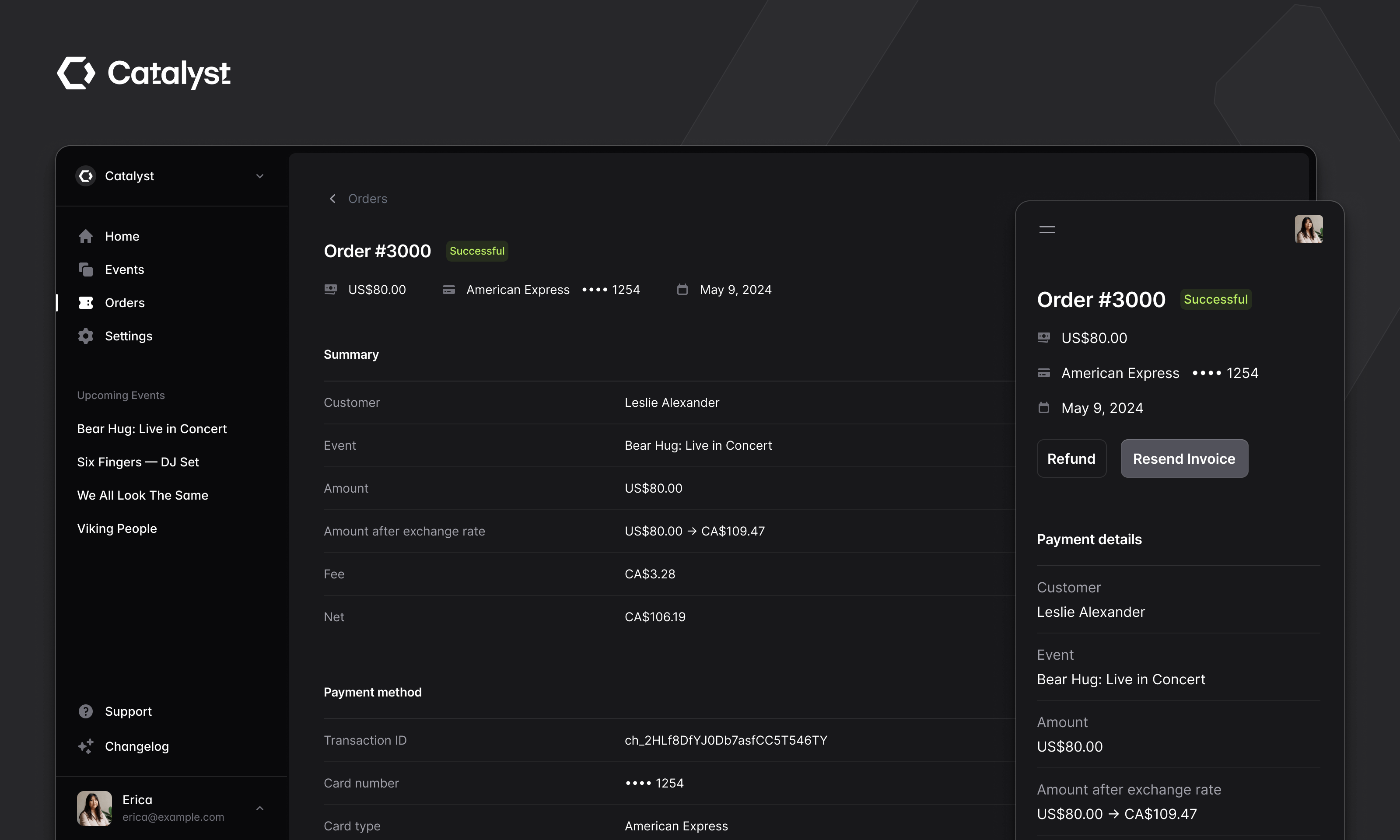
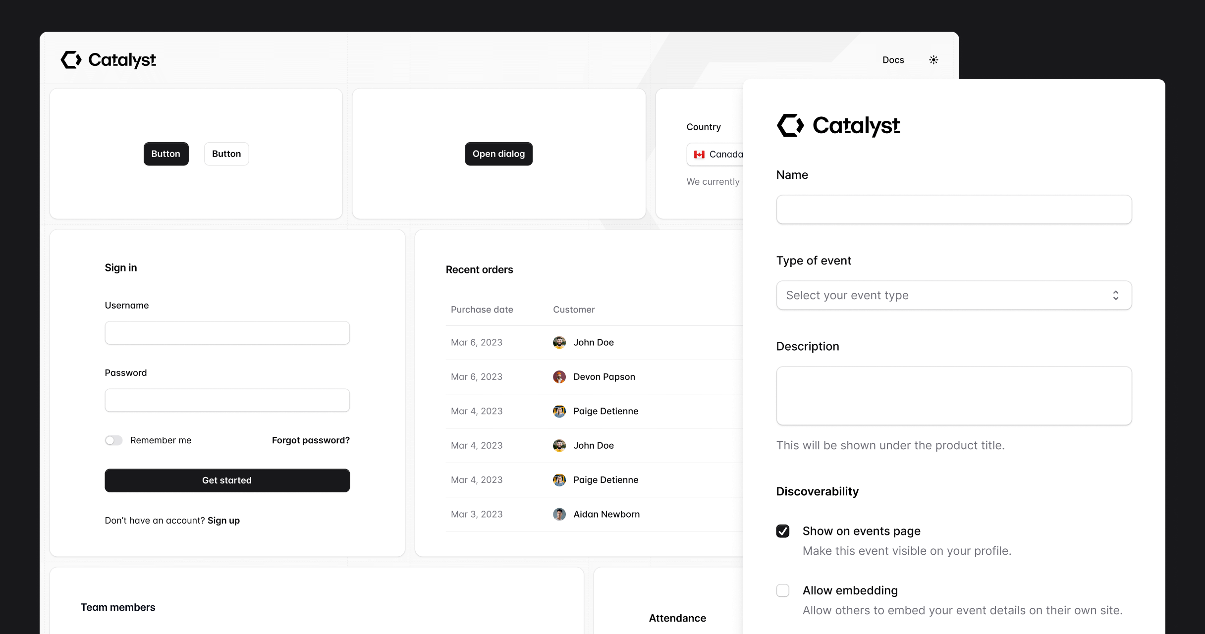
New Catalyst combobox component and auth pages
Catalyst just got a big update with a brand new Combobox component as well as three new auth page examples, including a login page, a registration page, and a forgot password page.
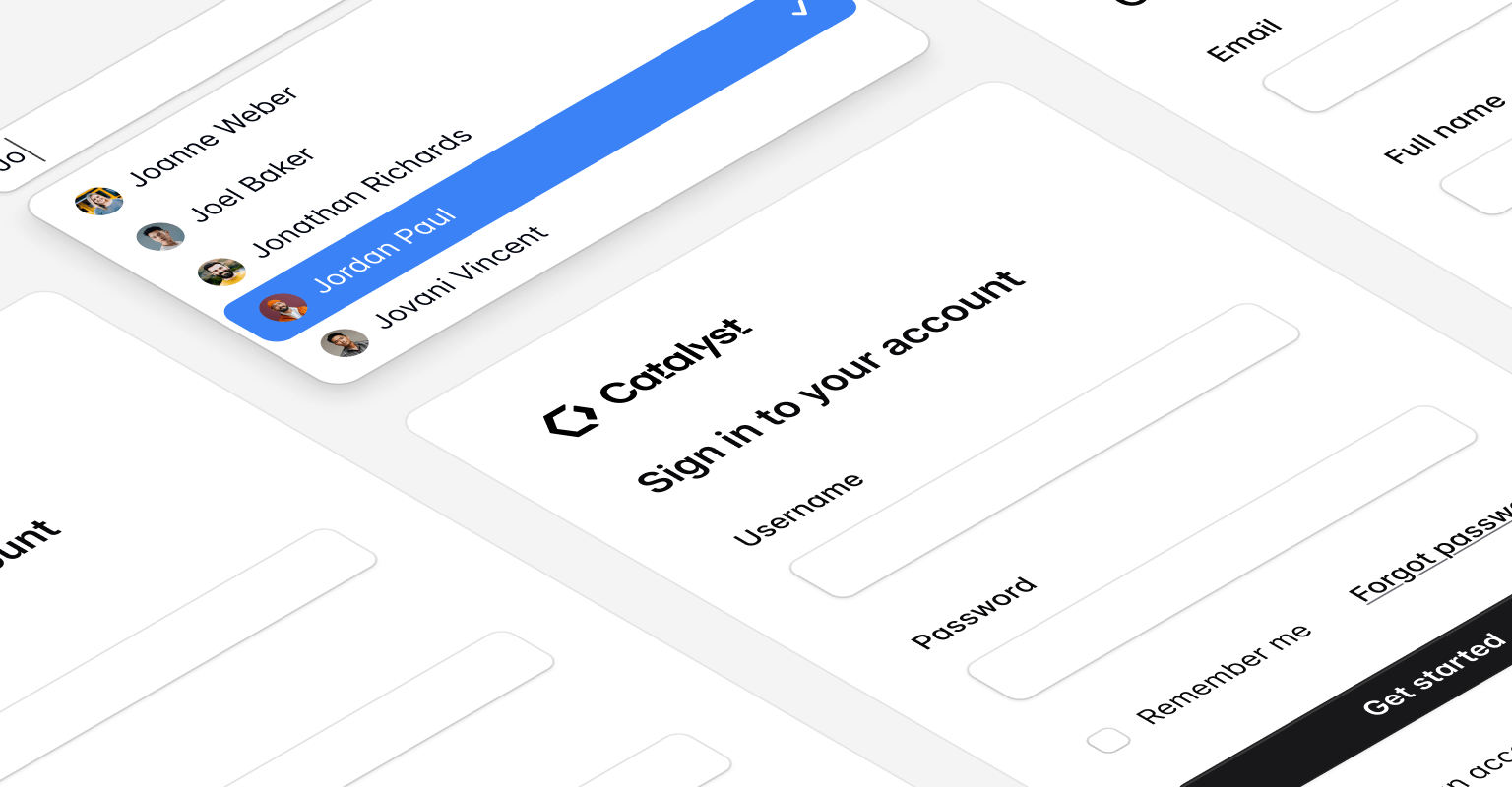
As always, we've taken a lot of care while building these components to make sure they look great, and are also awesome to work with from a DX perspective.
Check out the homepage and documentation to learn more about Catalyst and get started with it in your projects.
Tailwind CSS v4.0 support
We've updated all of the examples in Tailwind Plus to support Tailwind CSS v4.0! In the "Code" tab of any component you’ll now find a picker to toggle between v4.0 and v3.4.
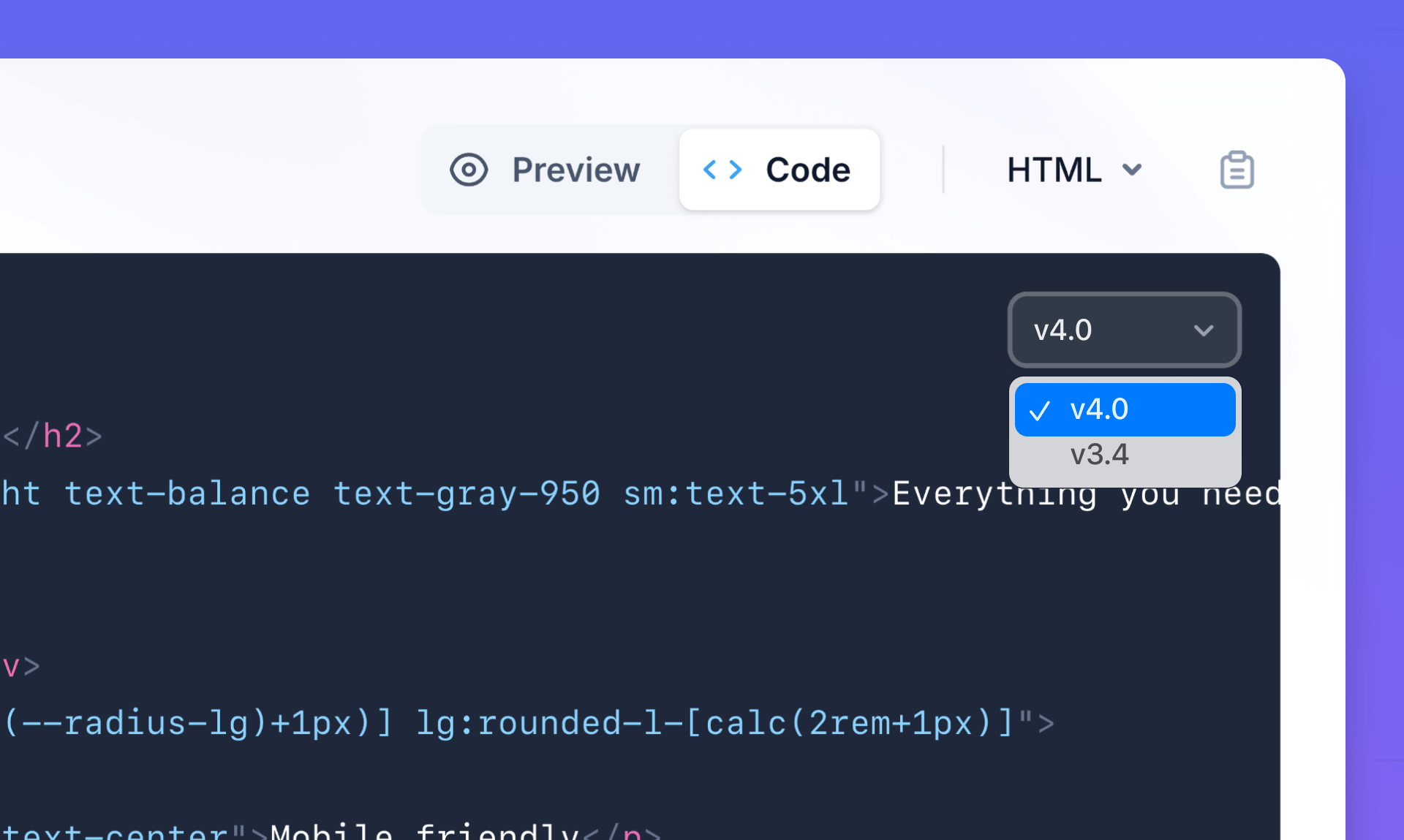
The differences between versions are very small, but the v4.0 snippets make sure to take advantage of the new features introduced in v4 to simplify the code, and also handle any breaking changes in this release.
See the announcement post to learn more about Tailwind CSS v4.0.
New content section, footers, and feature sections
We just added five new marketing blocks, inspired by some of the ideas we designed for our recent Radiant template.
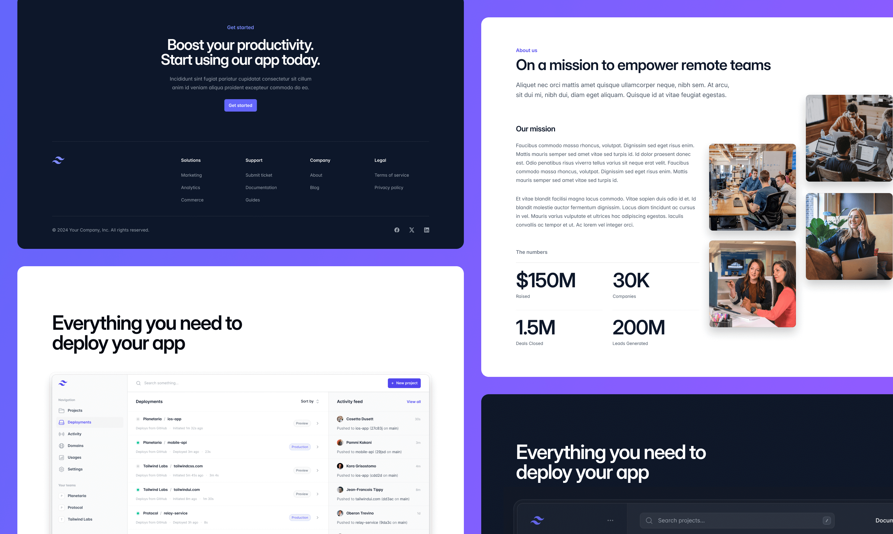
We've added a brand new content section with image tiles and stats — perfect for an about page.
There's also a new feature section example with a large screenshot framed by a stylish, glassy border. This example works great when you want to display a prominent screenshot of your app, available in both light and dark versions.
Finally, we've added a new footer example with a prominent call to action for those of you who love big chunky site footers. This too comes in light and dark versions.
New pricing table example
We just added a huge new pricing section example, with fancy glass pricing cards, a logo cloud, and a full feature comparison table that automatically cleverly switches to tabs on mobile.
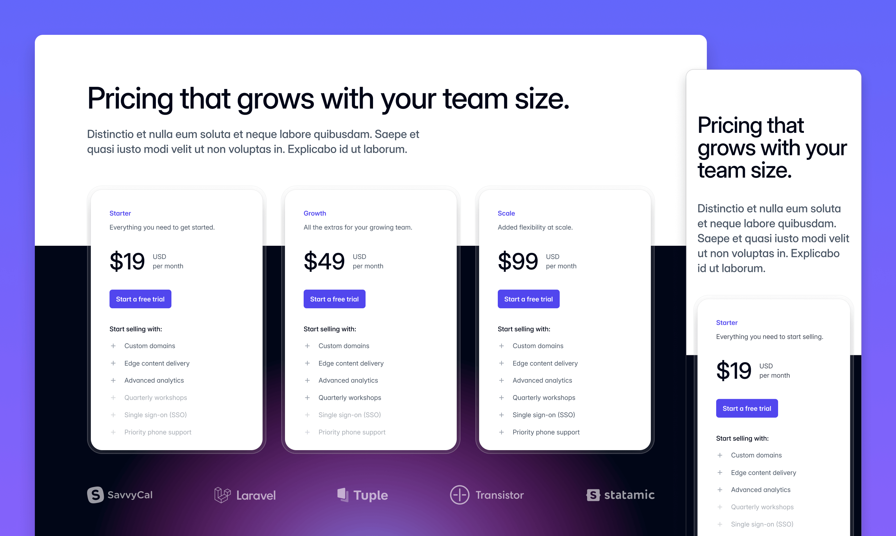
As always, we've agonized over all the little details so you don't have to, like fine-tuning all of the breakpoints, getting the semantic markup just right, and making sure everything is accessible to screen readers.
Bento grids
We just added a brand new Bento Grids category to our collection of marketing components, with three beautifully designed examples to get you started.
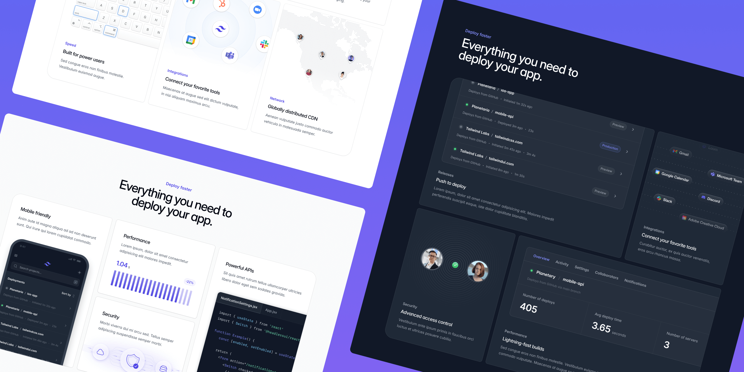
These seem to be all the rage right now, and they work great as feature sections on a marketing site.
Give them a shot in your next project — we've designed them with customization in mind, making it really easy to swap out the graphics with your own screenshots without having to sweat all the details yourself.
Radiant: A beautiful multi-page marketing website for your SaaS business
We've just released Radiant, a beautiful multi-page SaaS marketing template built with Next.js, Tailwind CSS, with a blog powered by Sanity.
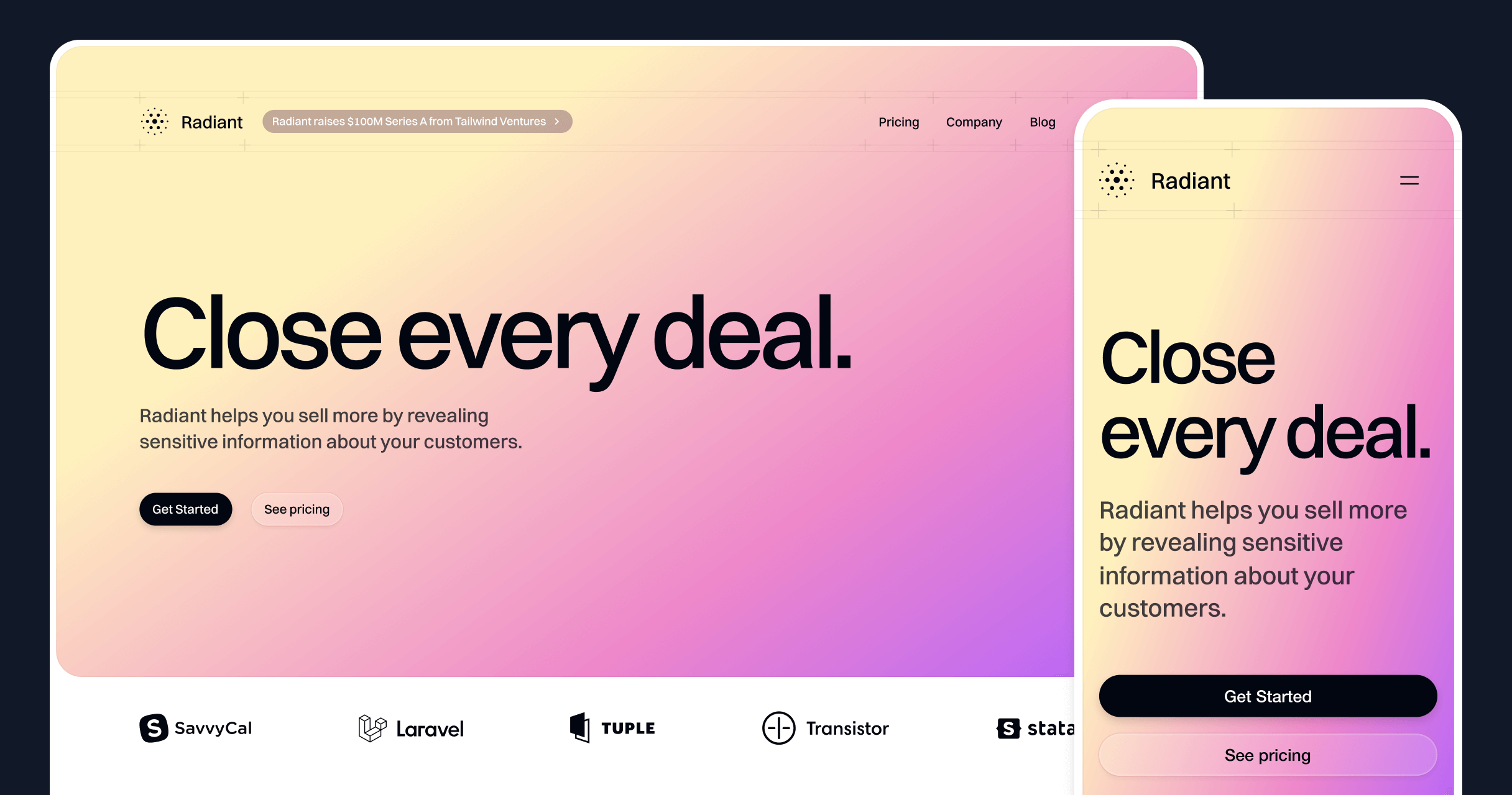
We had a lot of fun with the animations on this one, and designed a set of very general purpose interactive marketing components that are easy to adapt for completely different products.
It's also the first time we've tried out a headless CMS in a template, making it a great reference for wiring up a tool like Sanity in your own Tailwind CSS and Next.js projects.
Improved compatibility with React Server Components
The React examples in Tailwind UI are now easier to use with React Server Components (RSC).

Server components don't support passing functions as props, so anywhere we did that in Tailwind UI you'd need to make the parent a client component, even when that component had no actual interactivity.
Using the new data-* state attributes in Headless UI v2.0, we were able to remove all of the render props that we were using to conditionally apply different classes based on the state of the component.
We've also updated any components that do need to be client components to include 'use client' at the top of the example, so you can copy and paste them into your RSC project and they'll work right away.
Headless UI v2.1 for React
We've just updated all the React components in Tailwind UI as well as our Next.js templates to use the new data-attribute-based transition API that shipped in Headless UI v2.1.
See our announcement post to learn more about this new transition API.
Catalyst: Application layouts, navigation menus, description lists, and more
We just published the first major update to Catalyst since releasing the development preview, with two new application layouts, navbar and sidebar components, description lists, and more.
Here's a complete list of all the new components, available in both JavaScript and TypeScript:
We’re also pumped to share that with the release of Headless UI v2.0 for React, Catalyst is no longer in development preview — it’s officially stable and you can start using it in production today without worrying about breaking changes in the underlying dependencies.
Check out our brand new live demo site to see what a full Catalyst project looks and feels like after these updates for yourself.
Headless UI v2.0 for React
We've just updated all the React components in Tailwind UI as well as our Next.js templates to use Headless UI v2.0, the latest major version of this library that we released just a couple weeks ago.
Headless UI v2.0 is jammed-packed with new features, including built-in anchor positioning, a new checkbox component, combobox list virtualization, and much more. See our announcement post for all the details.
We recommend upgrading existing Headless UI v1.x projects to this latest version, and have put together a detailed upgrade guide explaining what's all changed.
Introducing Catalyst: A modern application UI kit for React
We just released the first development preview of Catalyst, our first fully-componentized, batteries-included application UI kit for React — real components with thoughtfully designed APIs that build on each other to create a real component architecture, the same way we’d do it in a real application.
There’s a lot more to come, but we’re releasing it today so you can play with it right away as we continue to build new components and find ways to make it an even better experience.
Next.js site templates now available in TypeScript
All of our Next.js site templates are now available in both JavaScript and TypeScript, so you can choose whichever language is the better fit for you and your team.

When you download a template, you'll find two folders in the zip file — /{template}-js and /{template}-ts, each containing the source code for the entire template in the corresponding language.
Each template has been authored with the latest version of TypeScript by nerds who get way too much satisfaction out of getting the types just right, so if TypeScript is your thing, you should find the experience very satisfying.
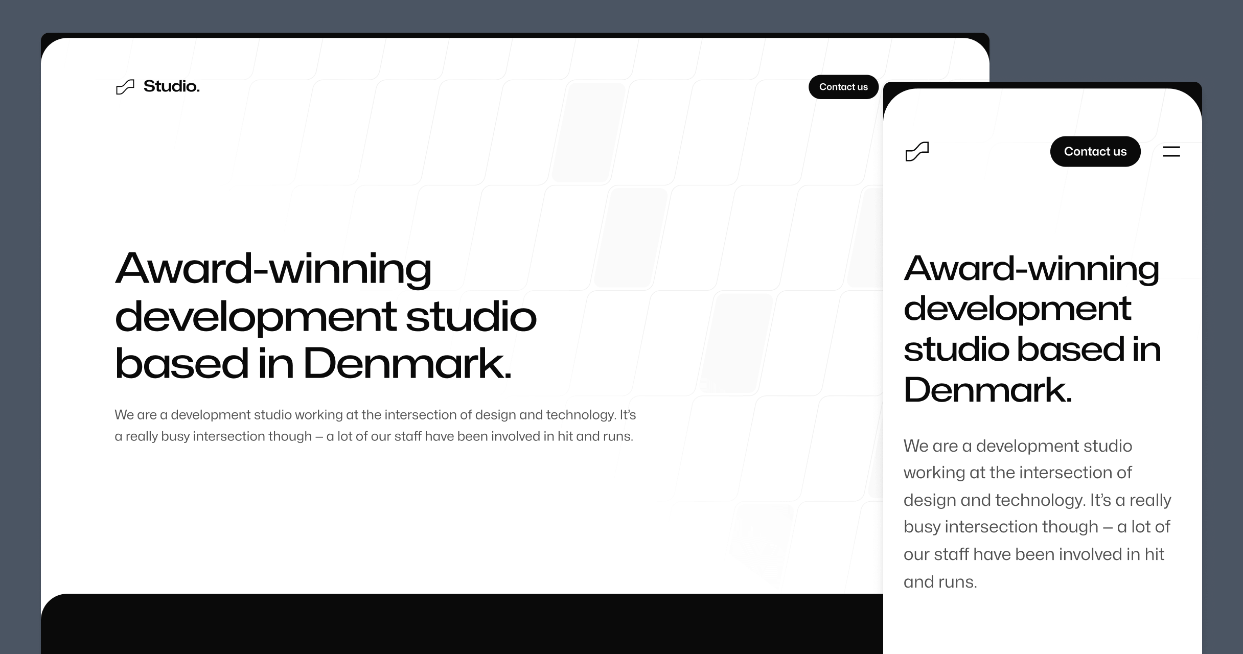
Meet Studio: A beautiful new multi-page agency template
We've just released Studio, a beautiful new multi-page agency template built with Tailwind CSS and Next.js. This is our largest template to date, and it takes advantage of the new app router in Next.js.
We really sweat the details with this template, like using Framer Motion to tastefully include subtle animations throughout the template, and MDX to make the case study and blog post authoring experience a great one.
All-new application UI pages + huge component update
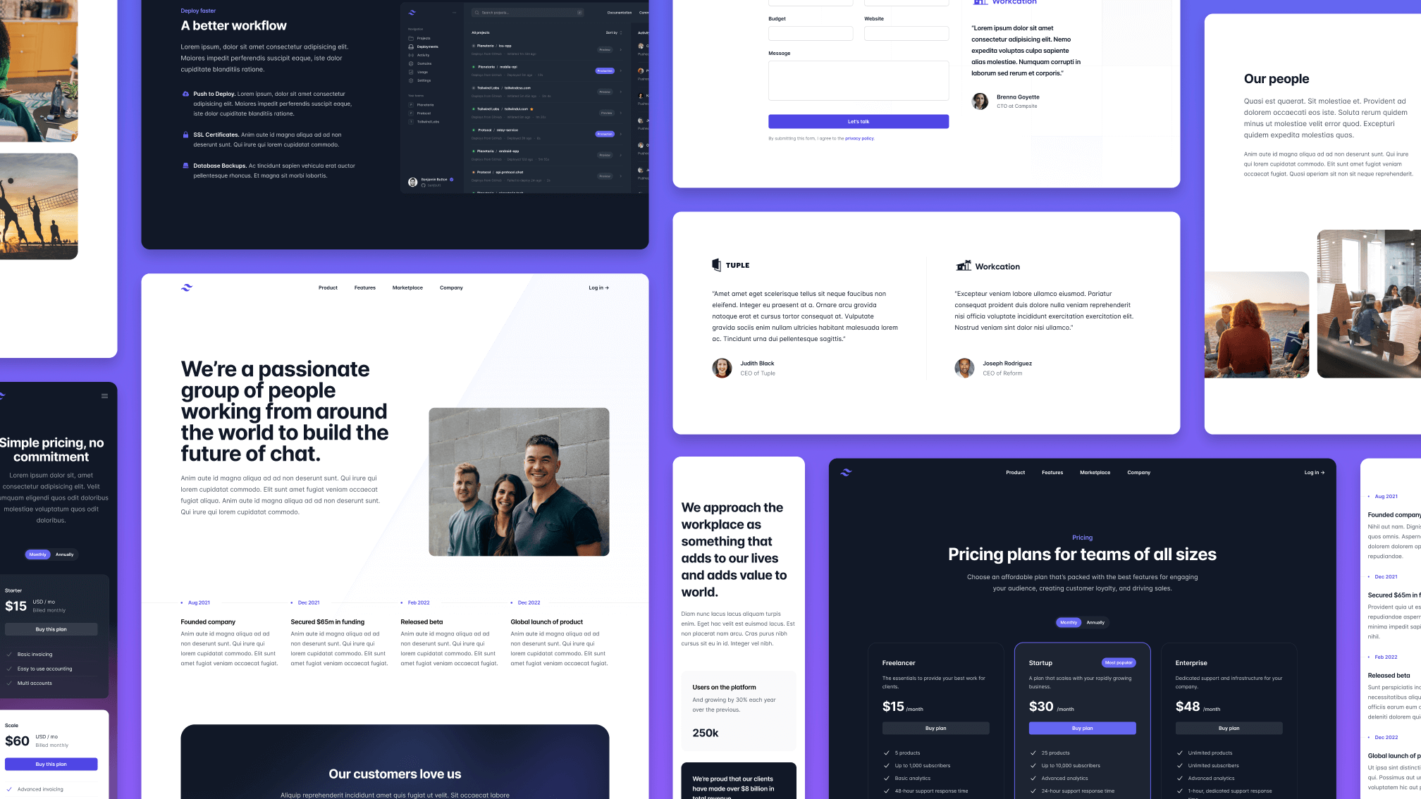
We just shipped a big application UI refresh that includes totally redesigned page examples, and dozens of updated and brand new components.
The new page examples include both light and dark designs, and also include the highly coveted home screen design everyone has been asking us for after seeing it used as screenshots in some of our new marketing components.
- Added 2 new designs to the Home Screens category
- Added 2 new designs to the Detail Screens category
- Added 2 new designs to a new Settings Screens category
We also went through all of the existing component categories to find opportunities for improvements, including new badges, stacked lists, tables, form layouts, stats sections, and more.
- Updated the Badges category with 18 new designs
- Updated the Buttons category with 3 new designs
- Updated the Description Lists category with 7 new designs
- Updated the Feeds category with 1 new design
- Updated the Form Layouts category with 5 new designs
- Updated the Grid Lists category with 1 new design
- Updated the Multi-Column Layouts category with 6 new designs
- Updated the Page Headings category with 2 new designs
- Updated the Sidebar Layouts category with 8 new designs
- Updated the Sidebar Navigation category with 5 new designs
- Updated the Sign-in and Registration category with 5 new designs
- Updated the Stacked Lists category with 17 new designs
- Updated the Stats category with 2 new designs
- Updated the Tables category with 3 new designs
- Updated the Tabs category with 1 new design
- Updated the Vertical Navigation category with 5 new designs
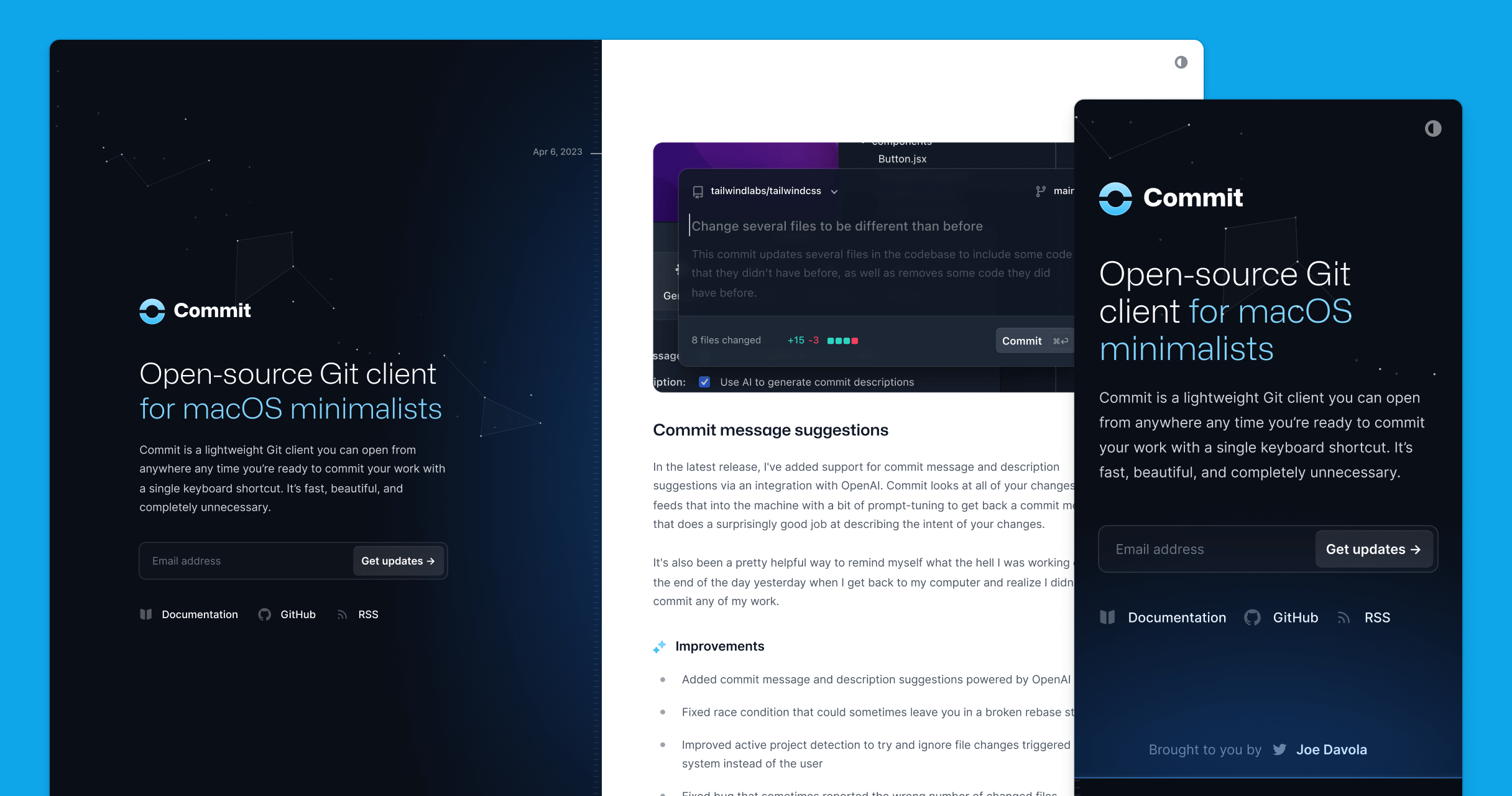
Introducing Commit: A beautiful new changelog template
We've just released Commit, a beautiful new changelog template built with Tailwind CSS, Next.js, MDX, and a dash of Motion One.
Inspired by plaintext CHANGELOG files, we've built the whole thing in a way that you manage it all from one glorious markdown file — just slap a horizontal rule above your last post and start typing.
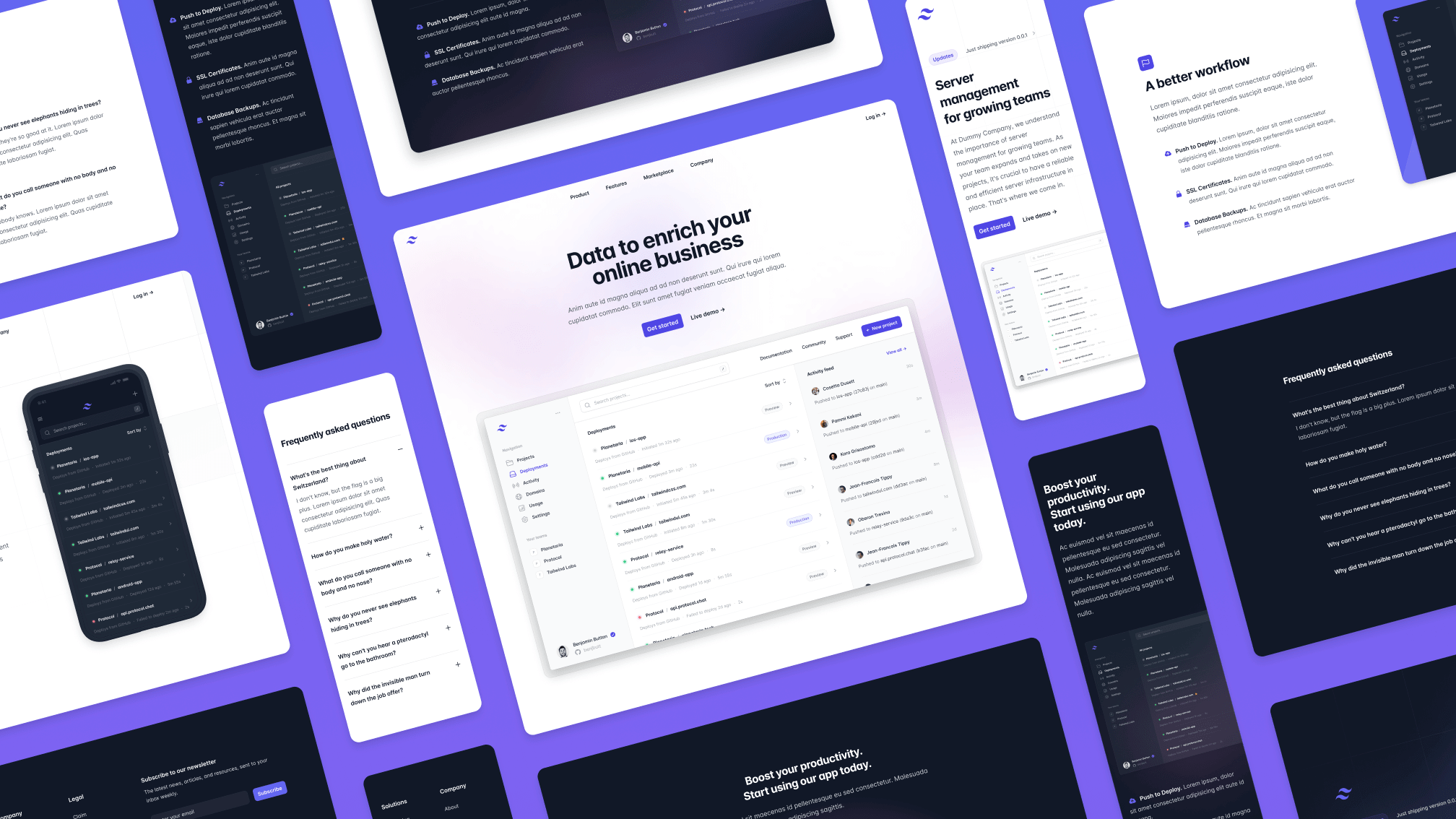
All-new marketing page examples + tons of component updates
If you've been watching closely, you might have noticed a lot of "new" badges all over the marketing category the last few weeks.
We decided it was time to give all of the marketing components a fresh coat of paint, starting with all-new designs for all of the page examples:
- Added 4 new designs to the Landing Pages category
- Added 3 new designs to the Pricing Pages category
- Added 3 new designs to a new About Pages category
We've also updated every individual marketing component category with new designs, including beautiful new pricing sections, testimonials, logo clouds, team sections, stats, and tons more.
- Updated the Pricing Sections category with 13 new designs
- Updated the Testimonials category with 9 new designs
- Updated the Logo Clouds category with 12 new designs
- Updated the Content Sections category with 6 new designs
- Updated the Banners category with 13 new designs
- Updated the Blog Sections category with 7 new designs
- Updated the Contact Sections category with 8 new designs
- Updated the Flyout Menus category with 7 new designs
- Updated the Header Sections category with 10 new designs
- Updated the Headers category with 12 new designs
- Updated the Newsletter Sections category with 7 new designs
- Updated the Stats category with 10 new designs
- Updated the Team Sections category with 9 new designs
- Updated the CTA Sections category with 2 new designs
- Updated the Feature Sections category with 2 new designs
- Updated the Footers category with 1 new design
- Updated the Hero Sections category with 2 new designs
New heroes, feature sections, CTAs, and more
We've been busy the last few weeks working on a big batch of fresh marketing components for Tailwind UI, including tons of new hero sections, feature sections, CTAs, and more.
We also spent a bunch of time going through the examples that were already there and gave them a bit of polish — we were pleasantly surprised to discover that yes, we actually have gotten better at design since we released some of these components almost three years ago.
- Updated all examples in the Hero Sections category, including 10 new designs
- Updated all examples in the Feature Sections category, including 10 new designs
- Updated all examples in the CTA Sections category, including 3 new designs
- Updated all examples in the FAQ Sections category, including 3 new designs
- Updated all examples in the Footers category
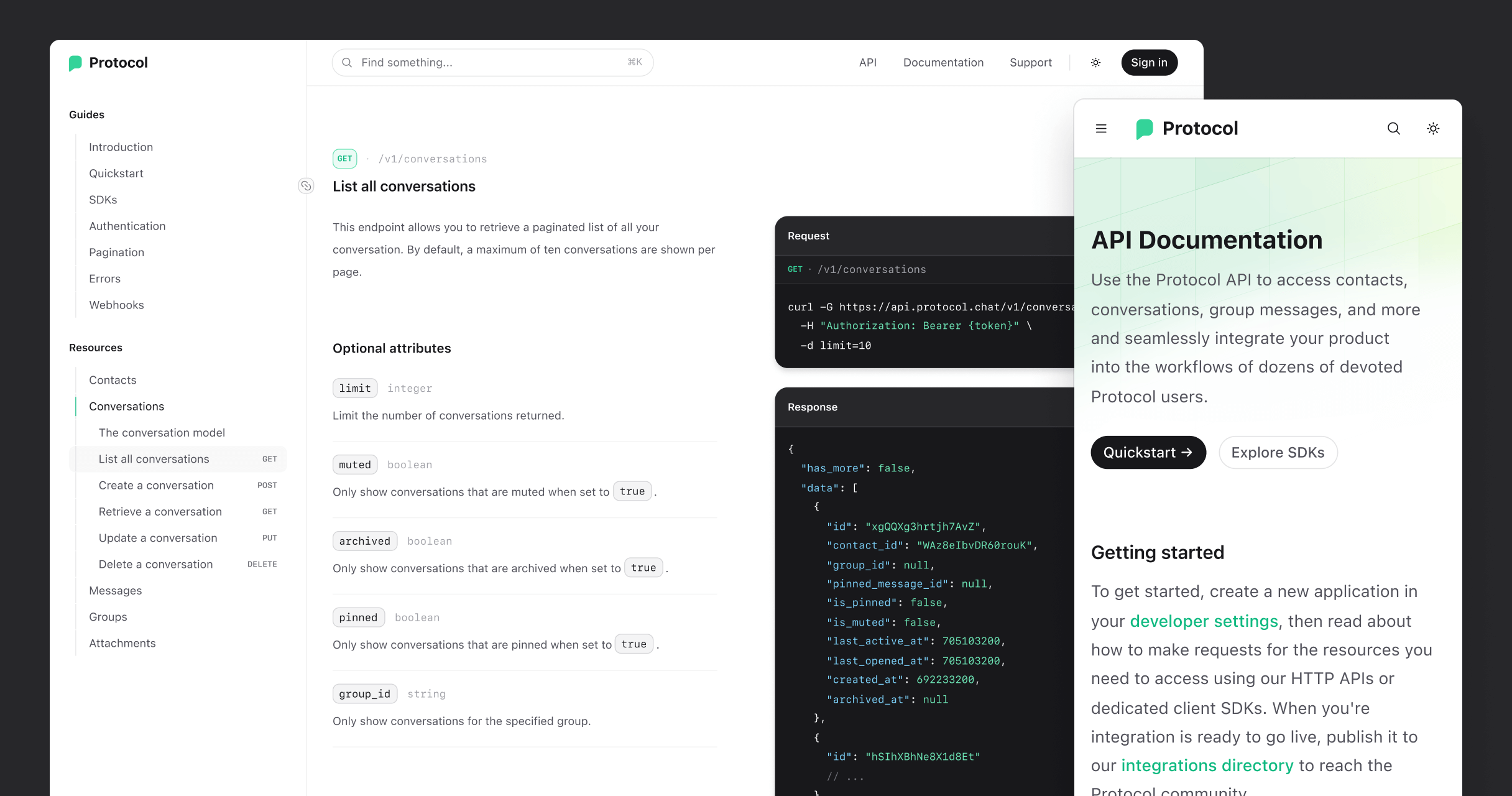
New Protocol template
Today we're happy to announce the launch of our new Protocol template, a meticulously crafted documentation template tuned for API references.
Powered by MDX, we've sweat all the nitty-gritty details to make sure the authoring experience is an awesome one, letting you focus on just writing great API docs, not the tooling around it.
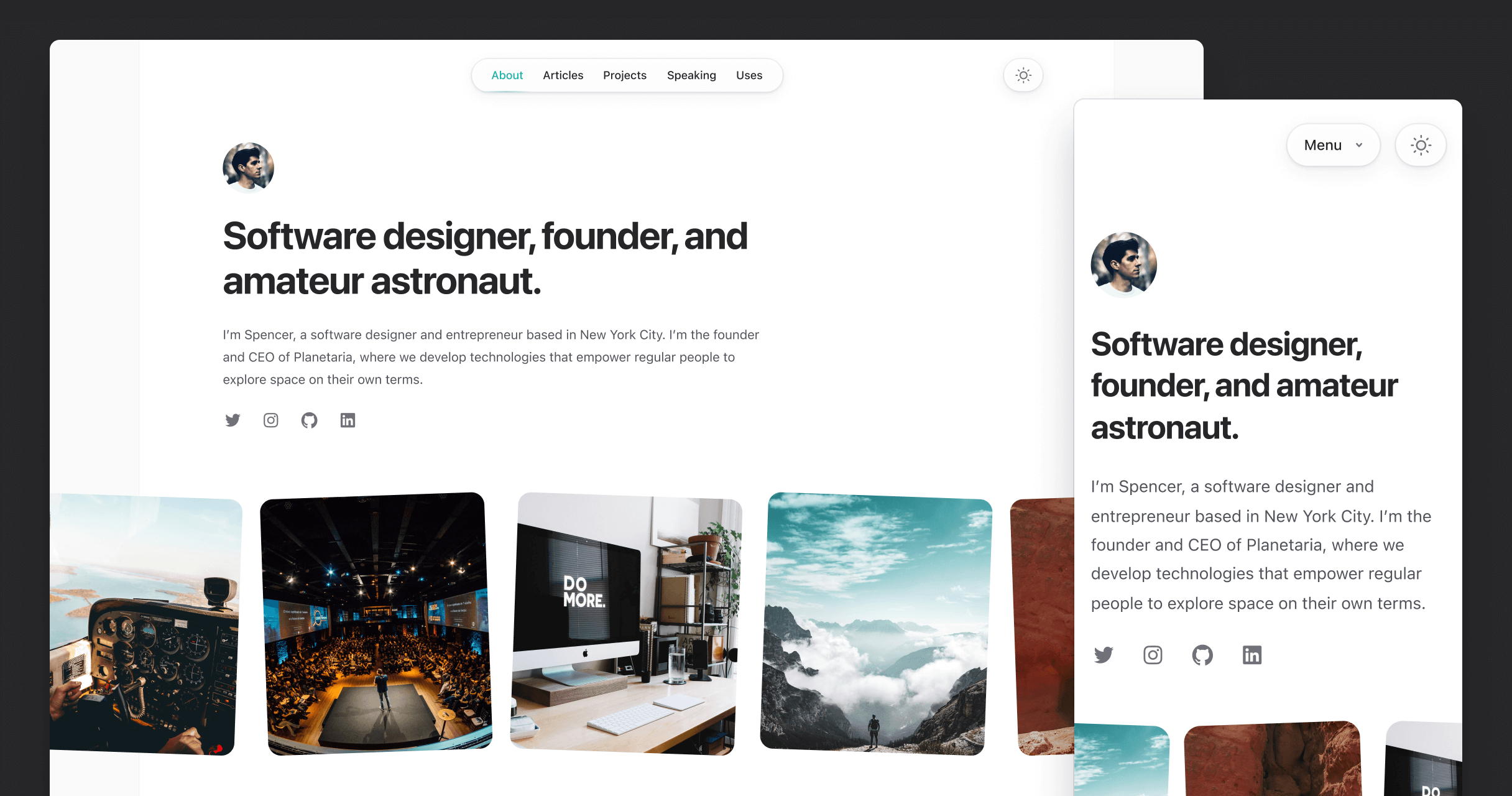
New Spotlight template
Today we're pumped to announce the launch of our new Spotlight template, a personal website so nice you'll actually be inspired to publish on it.
Built with Tailwind CSS and Next.js, it includes everything you need to get a personal website up-and-running, including a blog, projects page, dark mode, and more. And as always, it's been designed and built by the Tailwind CSS team.
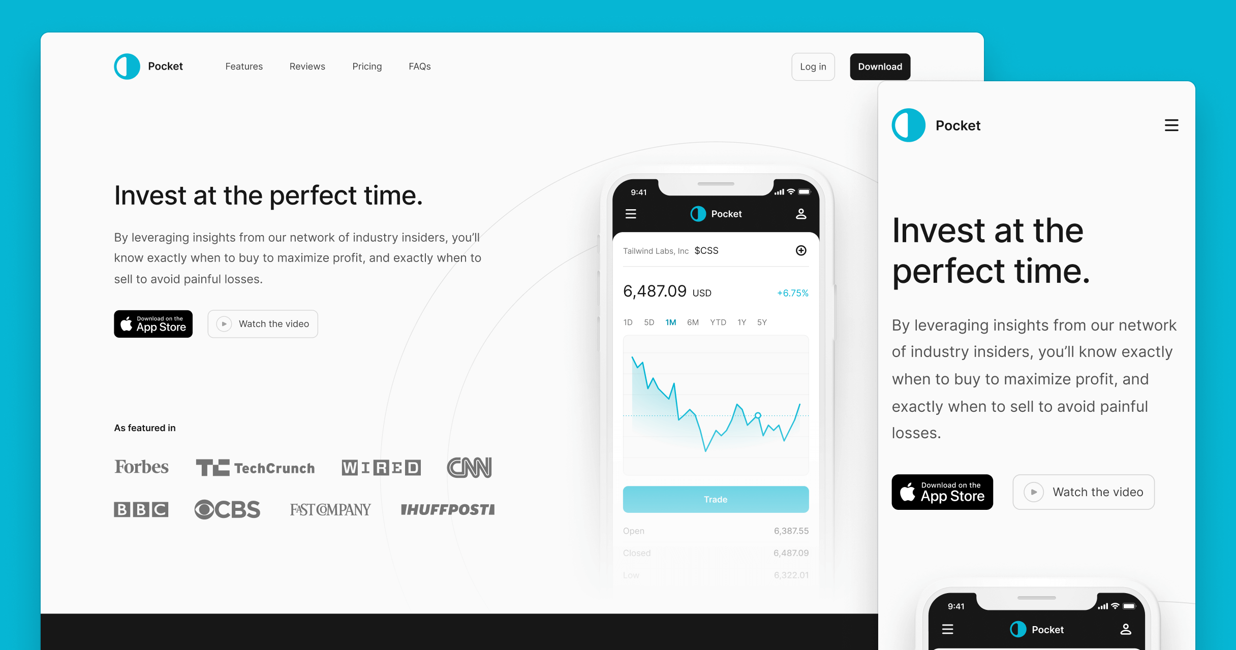
New Pocket template
Today we're happy to announce the launch of our new Pocket template, the perfect website template for your exciting new mobile app.
Built with Tailwind CSS and Next.js, Pocket is loaded with tons of fun animations and interactions powered by the Framer Motion library. Be sure to check out the live preview for the full experience.
Tailwind UI templates
Today we’re thrilled to announce the launch of Tailwind UI templates!
These are visually-stunning, easy to customize site templates built with React and Next.js. The perfect starting point for your next project and the ultimate resource for learning how experts build real websites with Tailwind CSS.
- Salient template - A beautiful SaaS landing page to announce your next big idea.
- Transmit template - A clean and professional podcast template fit for any show.
- Syntax template - Educate your users in style with this documentation template.
- Keynote template - Launch your next conference with a splash with this eye-catching template.
- Primer template - A stunning landing page for your first course or ebook.
New additions
- Added 16 new Table examples to the Application UI package
New additions
- Added new Comboboxes category to the Application UI package with 5 examples
- Added new Command Palettes category to the Application UI package with 9 examples
New additions
- Added new Calendars category to the Application UI package with 8 examples
New additions
- Added new Textareas category to the Application UI package with 5 examples
- Added 9 new Radio Group examples to the Application UI package
- Added 1 new Step example to the Application UI package
- Added 1 new FAQ example to the Marketing package
Tailwind UI Ecommerce
Today we’re excited to announce the launch of Tailwind UI Ecommerce!
Almost 6 months in the making, we finally released the first all-new component kit for Tailwind UI since the initial launch back in February 2020.
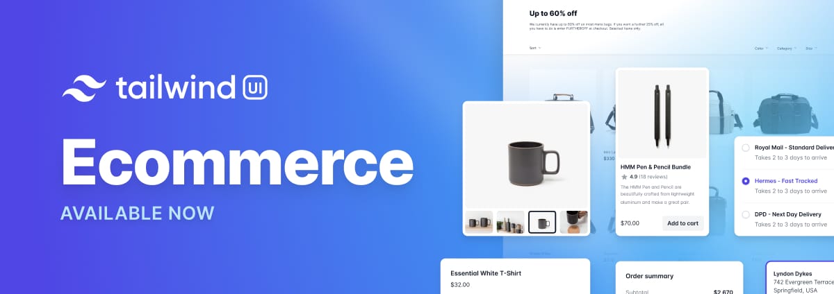
Tailwind UI Ecommerce adds over 100 new components across 14 new component categories and 7 new page example categories:
- Added new Product Overviews category to the Ecommerce package with 5 examples
- Added new Product Lists category to the Ecommerce package with 11 examples
- Added new Category Previews category to the Ecommerce package with 6 examples
- Added new Shopping Carts category to the Ecommerce package with 6 examples
- Added new Category Filters category to the Ecommerce package with 5 examples
- Added new Product Quickviews category to the Ecommerce package with 4 examples
- Added new Product Features category to the Ecommerce package with 9 examples
- Added new Store Navigation category to the Ecommerce package with 5 examples
- Added new Promo Sections category to the Ecommerce package with 8 examples
- Added new Checkout Forms category to the Ecommerce package with 5 examples
- Added new Reviews category to the Ecommerce package with 4 examples
- Added new Order Summaries category to the Ecommerce package with 4 examples
- Added new Order History category to the Ecommerce package with 4 examples
- Added new Incentives category to the Ecommerce package with 8 examples
- Added new Storefront Pages category to the Ecommerce package with 4 examples
- Added new Product Pages category to the Ecommerce package with 5 examples
- Added new Category Pages category to the Ecommerce package with 5 examples
- Added new Shopping Cart Pages category to the Ecommerce package with 3 examples
- Added new Checkout Pages category to the Ecommerce package with 5 examples
- Added new Order Detail Pages category to the Ecommerce package with 3 examples
- Added new Order History Pages category to the Ecommerce package with 5 examples
New additions
- Added new 404 Pages category to the Marketing package with 6 examples
- Added new Empty States category to the Application UI package with 6 examples
- Added 6 new Input Group examples to the Application UI package
- Added new Checkboxes category to the Application UI package with 4 examples
New additions
- Added 2 new Pricing Page examples to the Marketing package
- Added 2 new Pricing Section examples to the Marketing package
- Added 2 new FAQ examples to the Marketing package
- Added 1 new Testimonial example to the Marketing package
- Added 1 new Header example to the Marketing package
React and Vue support
Today we’re excited to add first class support for React and Vue 3 to all of the examples in Tailwind UI, which makes it even easier to adapt them for your projects.

It’s been a long journey but I am super proud of where we ended up on this one, and really think it’s going to make Tailwind UI a useful tool for a whole new group of Tailwind CSS users.
- Functional and accessible — all of the React and Vue examples in Tailwind UI are powered Headless UI which handles all of the ARIA attribute management, keyboard interactions, focus handling, and more for you, while keeping all of that gnarly complexity safely tucked away in your
node_modulesfolder where we can make improvements and fix bugs on your behalf, without you ever having to change your own code. - Fully customizable — with Headless UI, we’ve managed to abstract away all of the complicated JS functionality without taking away any control over the actual markup. That means that the entire design is still in entirely under your control, and you can fully customize any example by simply adding and removing utility classes like you’re used to.
All of this stuff is available as a totally free update for Tailwind UI customers. Just log in to your account, select between HTML, React, or Vue in the dropdown above any component, and grab the code in the format you want.
New additions
- Added 2 new Detail Screen examples to the Application UI package
- Added 1 new Settings Screen example to the Application UI package
- Added 2 new Multi-Column Layout examples to the Application UI package
- Added 2 new Page Heading examples to the Application UI package
- Added 1 new Grid List example to the Application UI package
- Added 1 new Select Menu example to the Application UI package
- Added 1 new Tabs example to the Application UI package
- Added 1 new Slide-over example to the Application UI package
New additions
- Added new Contact Pages to the Marketing package with 4 examples
- Added 1 new CTA Section example to the Marketing package
- Added 2 new Header Section examples to the Marketing package
- Added 2 new Newsletter Section examples to the Marketing package
- Added 2 new Contact Section examples to the Marketing package
New additions
- Added 1 new Home Screen example to the Application UI package
- Added 1 new Detail Screen example to the Application UI package
- Added 2 new Multi-Column Layout examples to the Application UI package
- Added 1 new Section Heading example to the Application UI package
- Added 1 new Card Heading example to the Application UI package
- Added 1 new Stacked List example to the Application UI package
- Added 1 new Tabs example to the Application UI package
- Added 1 new Navbar example to the Application UI package
New additions
- Added new Landing Page examples category to the Marketing package with 3 examples
- Added 4 new Feature Section examples to the Marketing package
- Added 3 new Hero Section examples to the Marketing package
- Added 1 new Content Section example to the Marketing package
- Added 1 new Newsletter Section example to the Marketing package
- Added 1 new Stat Section example to the Marketing package
- Added 1 new Testimonial example to the Marketing package
New additions
- Added new List Containers category to the Application UI package with 7 examples
- Added new Dividers category to the Application UI package with 8 examples
- Added 1 new Home Screen page example to the Application UI package
- Added 2 new Stacked List examples to the Application UI package
- Added 1 new Grid List example to the Application UI package
- Added 1 new Page Heading example to the Application UI package
- Added 1 new Stacked Layout application shell example to the Application UI package
New additions
- Added new Details Screens page examples to the Application UI package with 3 examples
- Added new Multi-Column Layouts category to the Application UI package with 3 examples
- Added new Feeds category to the Application UI package with 3 examples
- Added new Media Objects category to the Application UI package with 8 examples
- Added 2 new Buttons examples to the Application UI package
- Added 1 new Grid List example the Application UI package
- Added 2 new Page Headings examples to the Application UI package
- Added new Stacked List example to the Application UI package
New additions
- Added new Settings Screens category to the Application UI package with 4 examples
- Added new Breadcrumbs category to the Application UI package with 4 examples
- Added 1 new Stacked Layout example to the Application UI package
- Added 1 new Description List example to the Application UI package
- Added 1 new Form Layout example to the Application UI package
- Added 2 new Navbar examples to the Application UI package
- Added new Radio Groups category to the Application UI package with 3 examples
- Added 1 new Sidebar Layout example to the Application UI package
- Added 2 new Toggle examples to the Application UI package
- Added 1 new Stacked List example to the Application UI package
New additions
- Added new Pricing Pages category to the Marketing package with 4 examples
- Added new Header Sections category to the Marketing package with 3 examples
- Added 4 new Pricing Section examples to the Marketing package
- Added 2 new CTA Section examples to the Marketing package
- Added 3 new FAQ Section examples to the Marketing package
- Added 3 new Feature Section examples to the Marketing package
- Added 2 new Footer Section examples to the Marketing package
- Added 2 new Logo Cloud examples to the Marketing package
New additions
- Added new Team Sections category to the Marketing package with 8 examples
- Added new Section Headings category to the Application UI package with 9 examples
- Added new Steps category to the Application UI package with 7 examples
- Added 5 new Slide-Over examples to the Application UI package
New additions
- Added the first three Home Screen Examples to the Application UI package
New additions
- Added new Content Sections category to the Marketing package, with 5 examples
- Added new Sidebar Navigation category to the Application UI package, with 8 examples
New additions
- Added new Grid Lists category to the Application UI package, with 3 examples
- Added three new Hero Section examples to the Marketing package
New additions
- Added new Slide-Overs category to the Application UI package, with 6 examples
New additions
- Added new Select Menus category to the Application UI package, with 6 examples
New additions
- Added new Headers category to the Marketing package, with 4 examples
- Added new Flyout Menus category to the Marketing package, with 6 examples
New additions
- Added new Alerts category to the Application UI package, with 6 examples
- Added new Contact Sections category to the Marketing package, with 6 examples
- Fixed border color above profile section in sidebar of Branded Nav with Compact White Page Header stacked layout (from
border-gray-700toborder-indigo-800)
New additions
- Added new Stats category to the Application UI package, with 3 components to start
- Added new Notifications category to the Application UI package, with 6 components to start
- Added new Blog Sections category to the Marketing package, with 3 components to start
- Corrected
flex-no-shrinktoflex-shrink-0on Toggle components - Fixed truncation issue in Firefox on Description List components (see https://github.com/tailwindui/issues/issues/71)
- Fixed off-canvas menu in sidebar layouts being too wide for very small screens (see https://github.com/tailwindui/issues/issues/2)
Accessibility improvements
We started working with an accessibility consultant this week who has been going through our early access components and making sure we're following all best practices.
- Link toggle on Action panel with toggle to title/description through
aria-labelledbyandaria-describedby - Add alt attribute to logo images in Stacked Layouts
- Add
aria-labelattribute to icon-only buttons in Stacked Layouts (likearia-label="Notifications"on the bell buttons) - Add menu semantics to the avatar dropdowns on Stacked Layouts
New additions
- Added new Action Panels category, with 8 components to start
- Added new Layout Containers category, with 4 components to start
- Added new Layout Panels category, with 10 components to start
- Added two new Form Layout examples (two-column cards with separate submit actions and two-column in full-width cards)
- Added a new "Three-tier with emphasized tier" pricing section example
- Added Marketing Banners, with 4 components (we had these done on day one but they've been accidentally invisible the whole time due to a configuration typo! Derp.)
- Fixed focus/active styles for buttons in Page Headings and Card Headings (these were slightly inconsistent with the button styles we use elsewhere in Tailwind UI)
- Tweaked padding on footer of Modal with gray footer component (we had used
py-4initially butpy-3is more consistent) - We had
ddanddtelements backwards on our description list components — we've fixed that now!