Showcase
You can build anything with Tailwind CSS.
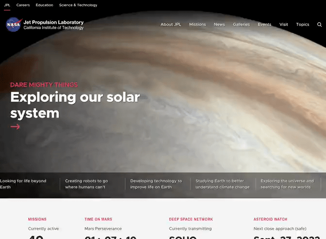
Well not quite anything, like you can't build a spaceship with it. But you can definitely build the website for the spaceship — NASA did.
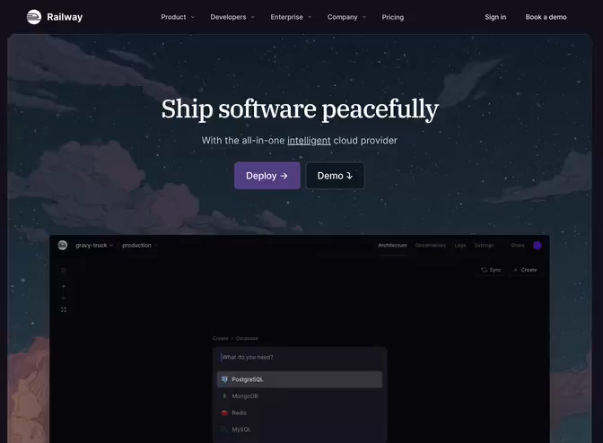
Railway
Hosting platform website
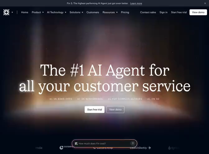
Fin
SaaS application website
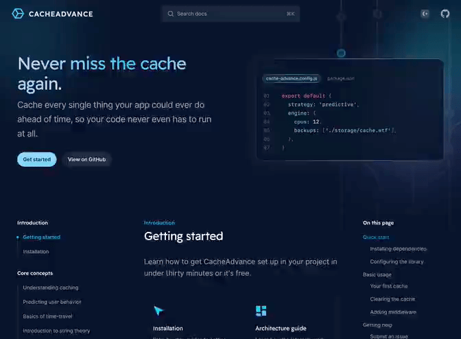
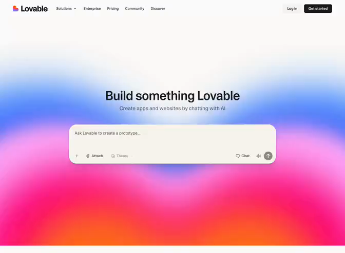
Lovable
Developer tool website
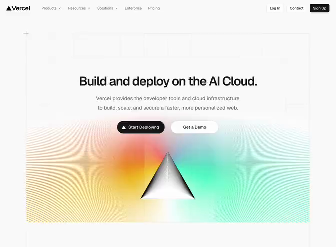
Vercel
Hosting platform website
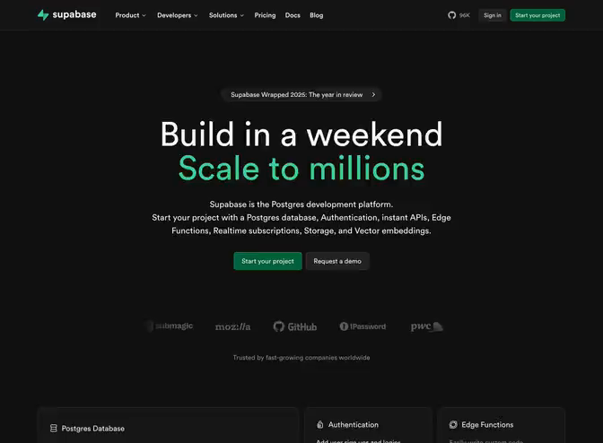
Supabase
Hosting platform website
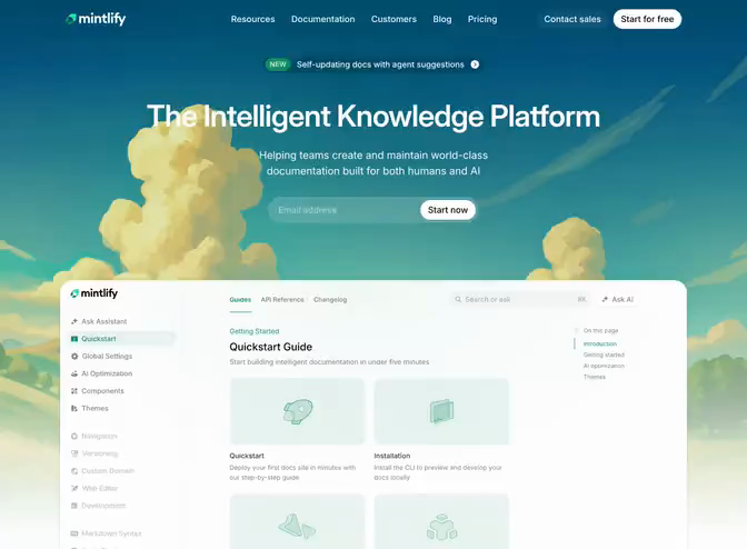
Mintlify
SaaS application website
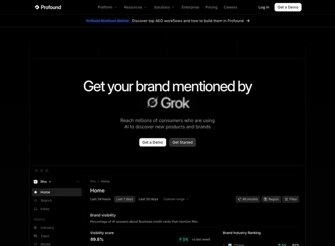
Profound
SaaS application website
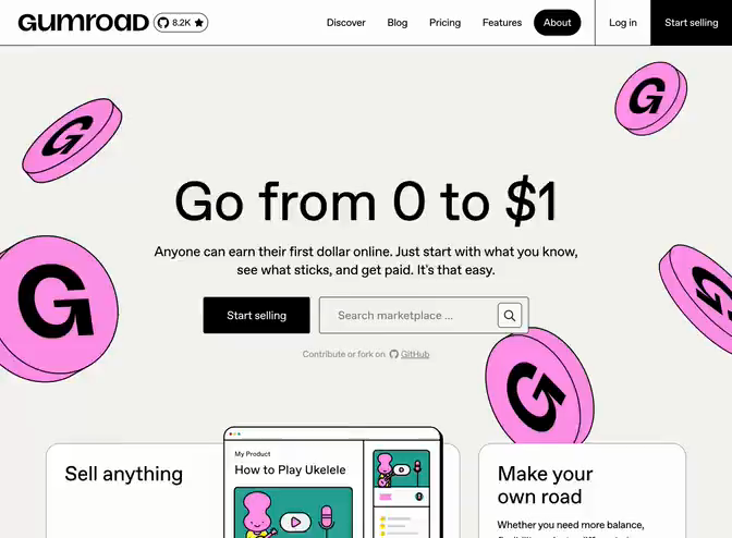
Gumroad
Ecommerce platform website
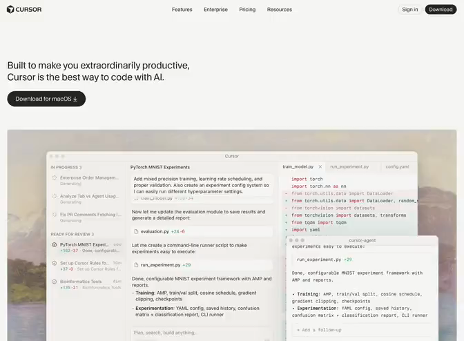
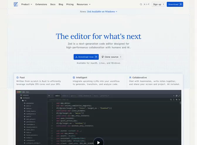
Cursor
Code editor website
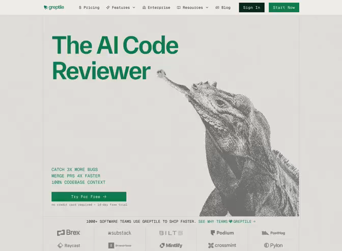
Greptile
Developer tool website
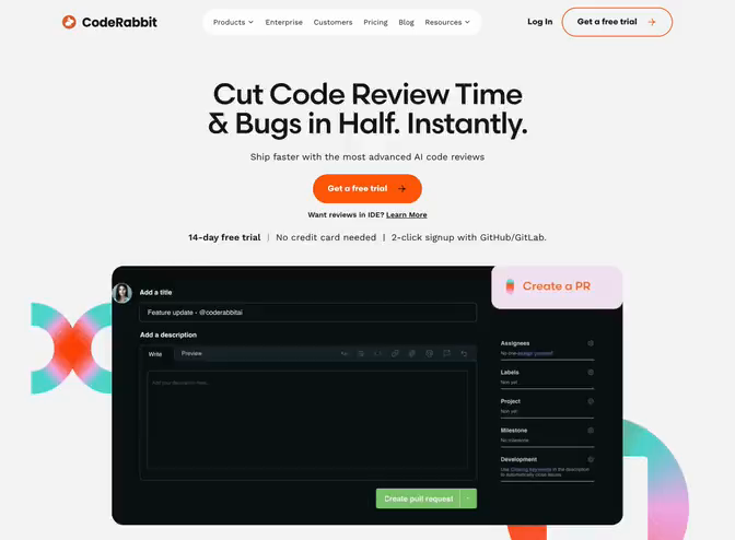
CodeRabbit
Developer tool website
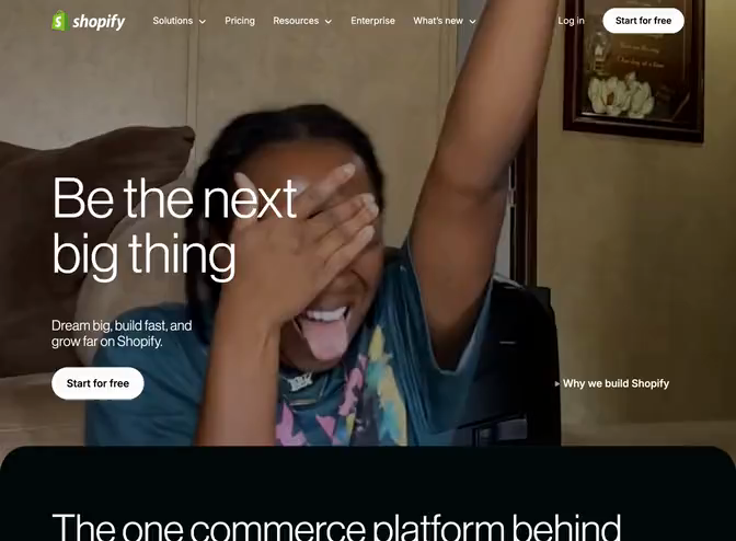
Shopify
Ecommerce platform website
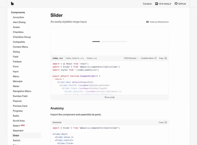
Base UI
Documentation website
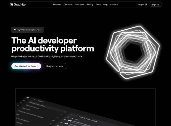
Graphite
Developer tool website
Clerk
Developer tool website
Resend
SaaS application website
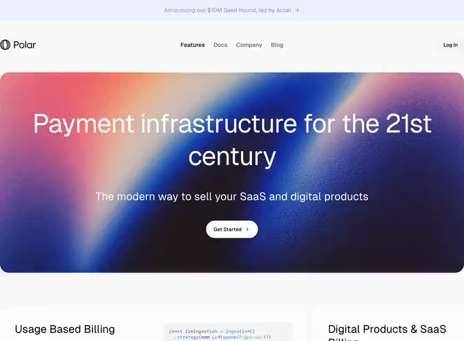
Polar
Fintech application website
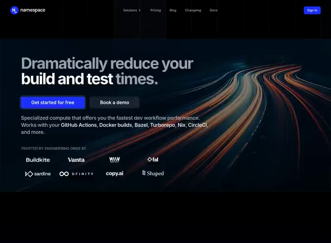
Namespace
Developer tool website
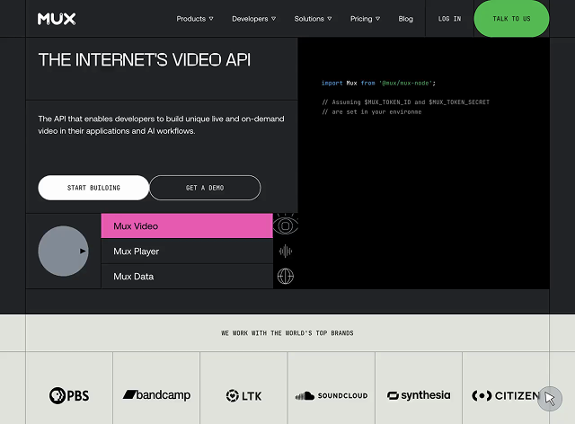
Mux
SaaS application website
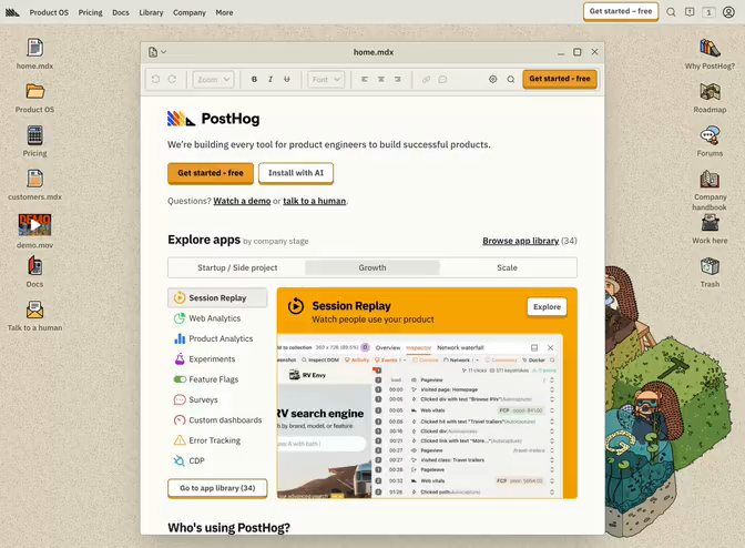
PostHog
SaaS application website
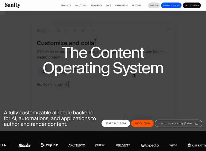
Sanity
CMS platform website
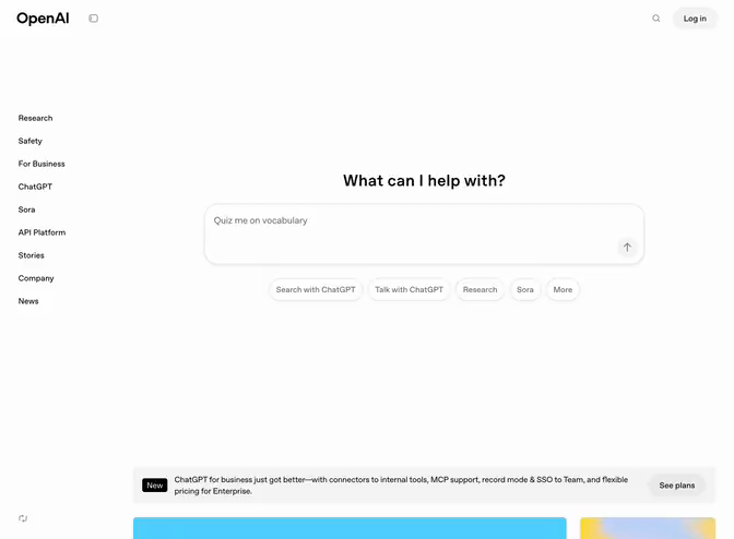
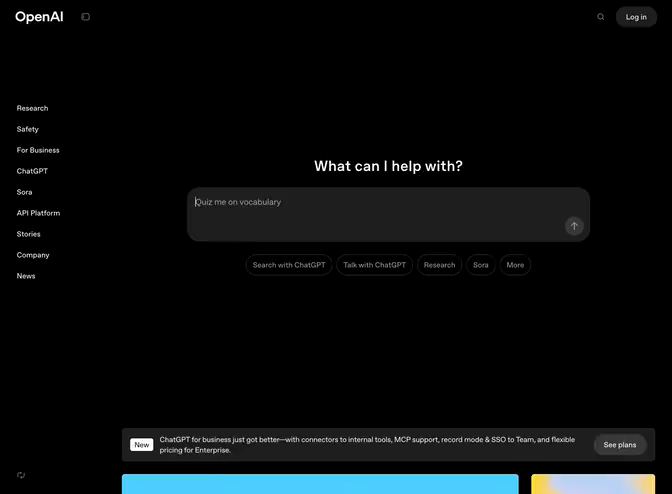
OpenAI / ChatGPT
Marketing website & chat interface
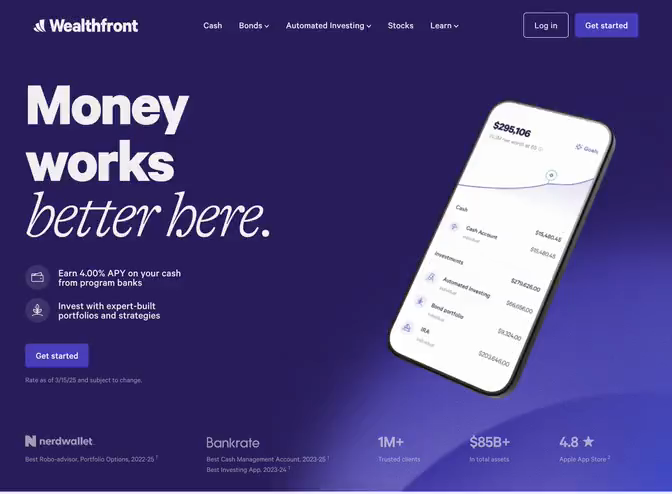
Wealthfront
Fintech marketing website
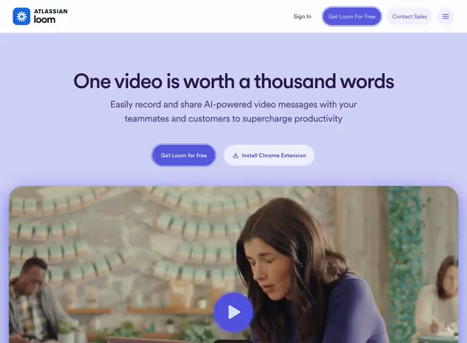
Loom
SaaS marketing website
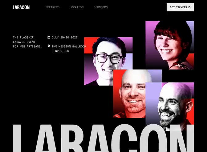
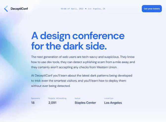
Laracon 2025
Conference website
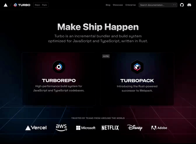
Turbo
Developer tool website
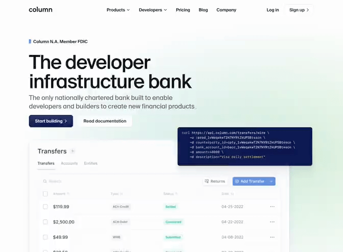
Column
Fintech marketing website
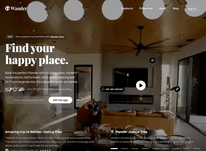
Wander
Vacation rental website
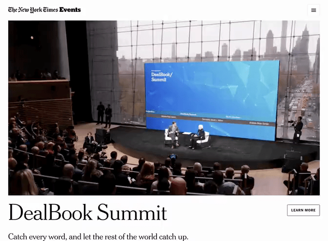
New York Times Events
News website
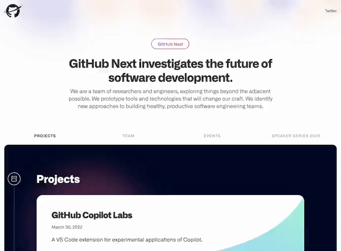
GitHub Next
Research website
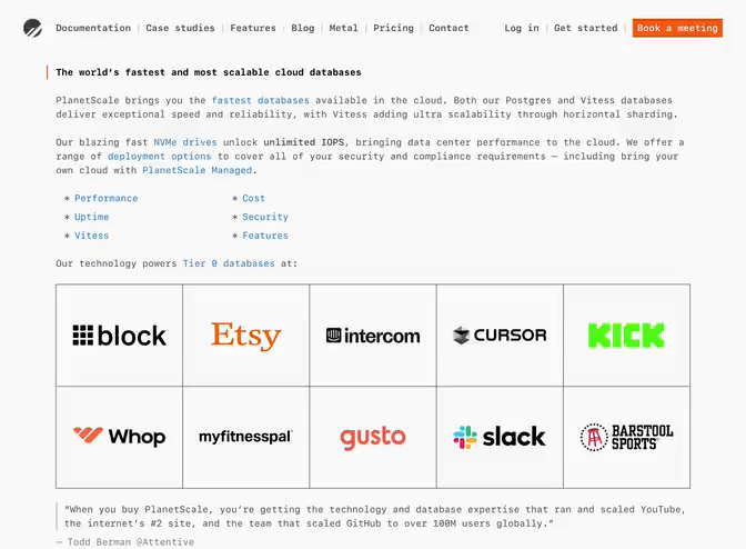
PlanetScale
SaaS marketing website
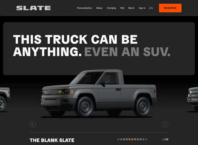
Slate Auto
Automotive website
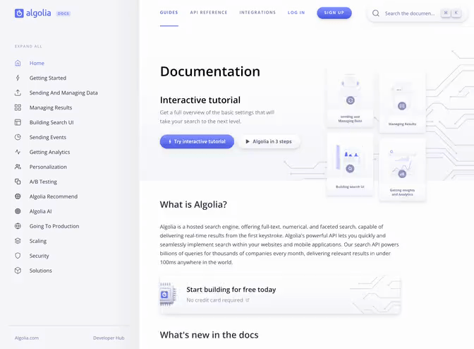
Algolia Docs
Documentation website
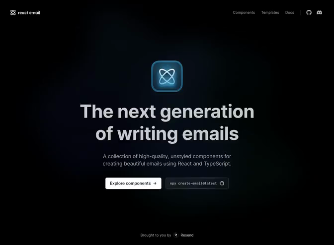
React Email
Developer tool website
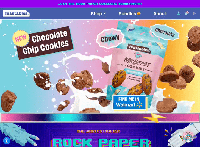
MrBeast Feastables
Direct-to-consumer store
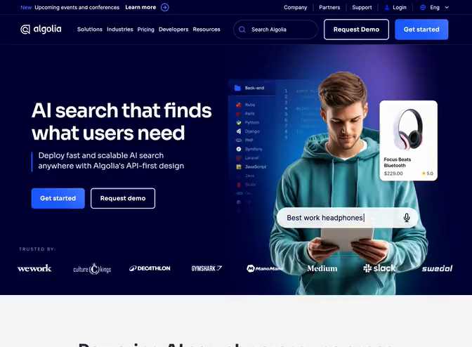
Algolia
SaaS marketing website
NASA Jet Propulsion Laboratory
Space laboratory website
Salient
Template
SaaS marketing website
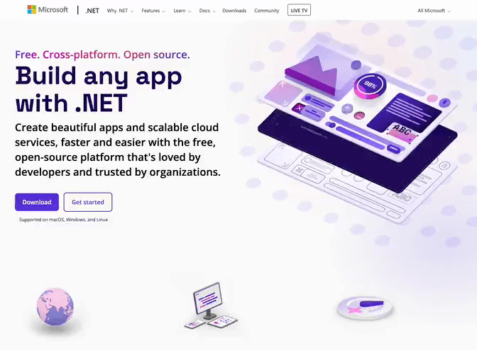
Microsoft .NET
Software framework website
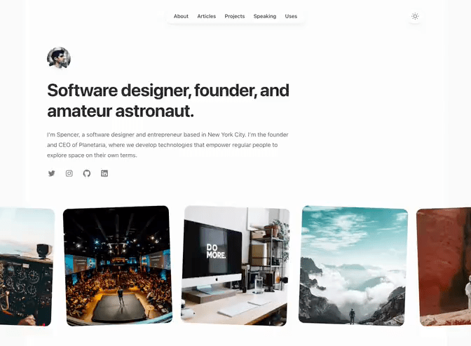
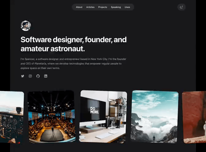
Spotlight
Template
Personal website
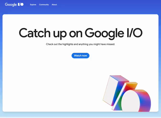
Google I/O
Conference website
Keynote
Template
Conference website
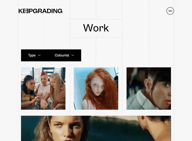
KeepGrading
Agency website
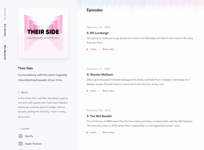
Transmit
Template
Podcast website
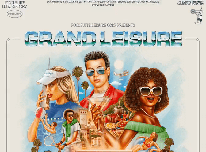
Poolsuite Grand Leisure
NFT marketing website
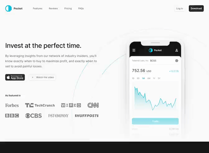
Pocket
Template
Mobile app marketing website
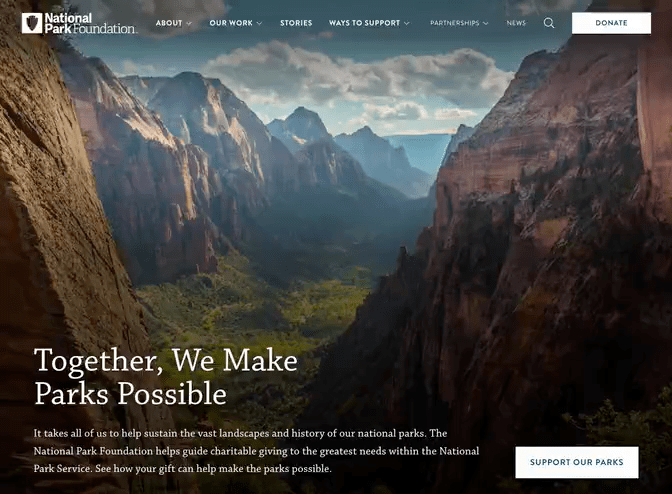
National Park Foundation
Nonprofit website
Syntax
Template
Documentation website
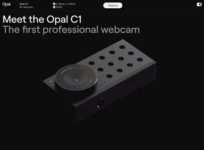
Opal
Product marketing website
Primer
Template
Info product website

