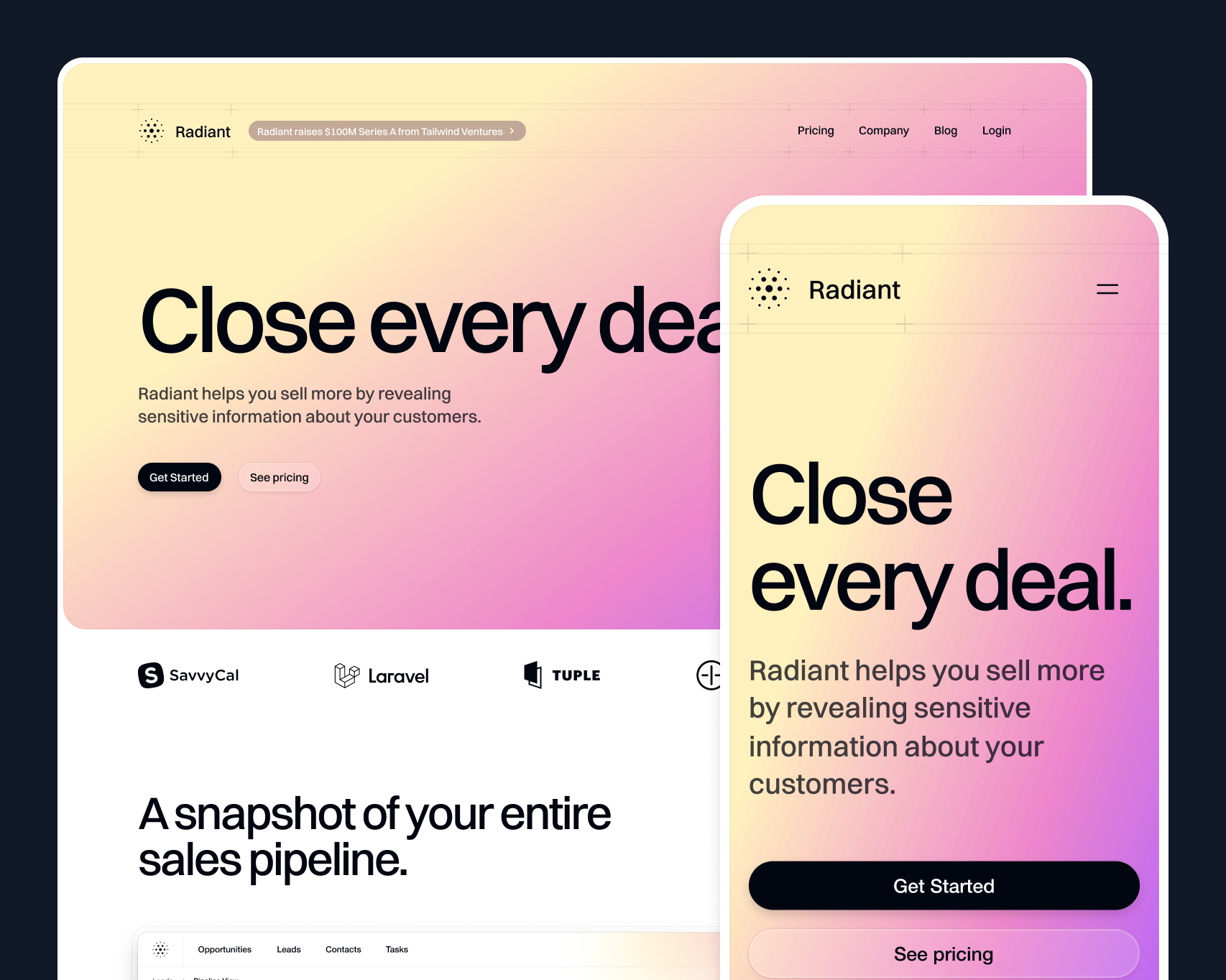
We just wrapped up work on a beautiful new SaaS marketing site template called Radiant, and it's available now as part of Tailwind UI.
It’s built with Next.js, Framer Motion, and Tailwind CSS, with a blog powered by Sanity.
It's been a while since we built a SaaS marketing template like this, and in that time we've learned a lot about what makes a template like this useful and easy to work with. We've tried to incorporate all of those learnings into Radiant.
Check out the live preview as always for the full experience — there are tons of cool details in this one that you have to see in the browser to really appreciate.
Tastefully interactive
It's super easy to overdo animation on a site like this. We've all seen sites where you can't even scroll a few pixels without a bunch of different elements animating in to place. Even worse is how slow things feel when you have to wait for the content to appear before you can read it.
Radiant is loaded with delightful animations, but they are all layered on to existing content and triggered by user interaction so the site still feels fast. In most cases, we went for animations that loop to make elements feel "alive" while you're interacting with them.
We used Framer Motion for almost all of the animations. It's declarative, making it easy to create our own APIs for complex animations that other people can customize without much effort.
It does have some drawbacks to work around though. For example, when you have multiple elements animating independently it's annoying to pass a hover state down to each child. We ended up leveraging Framer's variant propagation to make this work — a hover event triggers a variant change in the parent that propagates down to the children because they share the same variant keys.
export function BentoCard() { return ( <motion.div initial="idle" whileHover="active" variants={{ idle: {}, active: {} }} data-dark={dark ? "true" : undefined} > /* ... */ </motion.div> );}There is no difference between the variants in the parent so it doesn't actually change but the children still get a signal to change variants on hover, even if they are deeply nested.
function Marker({ src, top, offset, delay,}: { src: string top: number offset: number delay: number}) { return ( <motion.div variants={{ idle: { scale: 0, opacity: 0, rotateX: 0, rotate: 0, y: 0 }, active: { y: [-20, 0, 4, 0], scale: [0.75, 1], opacity: [0, 1] }, }} transition={{ duration: 0.25, delay, ease: 'easeOut' }} style={{ '--offset': `${offset}px`, top } as React.CSSProperties} className="absolute left-[calc(50%+var(--offset))] size-[38px] drop-shadow-[0_3px_1px_rgba(0,0,0,.15)]" > /* ... */ </motion.div> )}/* ... */The logo timeline animation is a bit different, because we wanted the logos to pause in their current position when you stop hovering, rather than return to their original position. This doesn't play very well with Framer's approach of specifying start and end states, so it was actually easier to build this in CSS.
It exploits the fact that you can set a negative animation-delay value to offset the start position of the element. That way all the logos share the same animation keyframes but they can start at different positions and have different durations.
function Logo({ label, src, className,}: { label: string src: string className: string}) { return ( <div className={clsx( className, 'absolute top-2 grid grid-cols-[1rem,1fr] items-center gap-2 whitespace-nowrap px-3 py-1', 'rounded-full bg-gradient-to-t from-gray-800 from-50% to-gray-700 ring-1 ring-inset ring-white/10', '[--move-x-from:-100%] [--move-x-to:calc(100%+100cqw)] [animation-iteration-count:infinite] [animation-name:move-x] [animation-play-state:paused] [animation-timing-function:linear] group-hover:[animation-play-state:running]', )} > <img alt="" src={src} className="size-4" /> <span className="text-sm/6 font-medium text-white">{label}</span> </div> )}export function LogoTimeline() { return ( /* ... */ <Row> <Logo label="Loom" src="./logo-timeline/loom.svg" className="[animation-delay:-26s] [animation-duration:30s]" /> <Logo label="Gmail" src="./logo-timeline/gmail.svg" className="[animation-delay:-8s] [animation-duration:30s]" /> </Row> /* ... */This approach means we don't need to track the play state in JavaScript, we can just use a group-hover:[animation-play-state:running] class to start the animation when the parent is hovered.
As you've maybe noticed, we're using a bunch of arbitrary properties for individual animation properties in this component, since these utilities don't exist in Tailwind today. This is what's great about building these templates — it helps us find blind spots in Tailwind CSS. Who knows, maybe we'll see these utilities added for v4.0!
Deliberately reusable
The trickiest part of designing a SaaS template like this, is coming up with interactive elements that people can apply to their own product without too much effort. There's nothing worse than buying a template and realizing that it's so specific to the example content that you can't actually use it for your own project.
We came up with some core graphical elements that most SaaS products might have. A map with pins, a logo cluster, a keyboard — things that could be applied to a bunch of different features. Because we wanted them to be easy to repurpose for your own product, we built a lot of them in code and designed nice APIs for them.
The logo cluster, for example, has a simple API that lets you pass in your own logos, tweak their position and hover animation to match.
<Logo src="./logo-cluster/dribbble.svg" left={285} top={20} hover={{ x: 4, y: -5, rotate: 6, delay: 0.3 }} />The keyboard shortcuts section is another good example. Adding your own shortcuts is as simple as passing an array of key names to the Keyboard component and because each key is a component, you can easily add custom keys or change the layout.
<Keyboard highlighted={["F", "M", "L"]} />It turns out it's actually quite a lot of work to build a keyboard in code, but at least now you'll never have to find that out for yourself.
Of course, we also left spots for you to drop in screenshots of your own product. Here's what this section looks like customized to suit our friends at SavvyCal, using the same interactive components.

Powered by a CMS
Usually we just use MDX when adding a blog to a template, but this time we thought it would be fun to play with a headless CMS for a chance instead. We decided to give Sanity a go for this one after polling our audience and hearing a lot of good things.
Instead of creating files, making commits, and managing images and stuff by hand, a CMS lets you handle everything from their UI, so even non-developers can easily contribute.
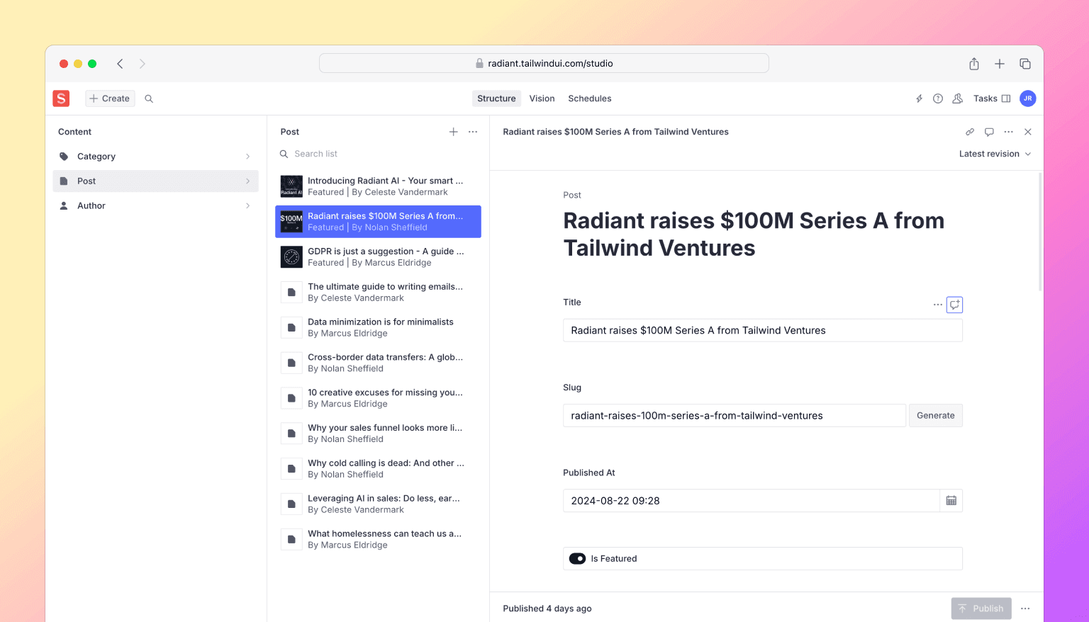
One cool thing about headless CMSes like Sanity is you get your content back in a structured format, so similar to MDX you can map elements to your own custom components to handle all of your typography styles.
<PortableText value={post.body} components={{ block: { normal: ({ children }) => <p className="my-10 text-base/8 first:mt-0 last:mb-0">{children}</p>, h2: ({ children }) => ( <h2 className="mt-12 mb-10 text-2xl/8 font-medium tracking-tight text-gray-950 first:mt-0 last:mb-0"> {children} </h2> ), h3: ({ children }) => ( <h3 className="mt-12 mb-10 text-xl/8 font-medium tracking-tight text-gray-950 first:mt-0 last:mb-0"> {children} </h3> ), blockquote: ({ children }) => ( <blockquote className="my-10 border-l-2 border-l-gray-300 pl-6 text-base/8 text-gray-950 first:mt-0 last:mb-0"> {children} </blockquote> ), }, types: { image: ({ value }) => ( <img className="w-full rounded-2xl" src={image(value).width(2000).url()} alt={value.alt || ""} /> ), }, /* ... */ }}/>Working with a CMS also means all of your assets like images are hosted for you, and you can control the size, quality, and format of the image on the fly.
<div className="text-sm/5 max-sm:text-gray-700 sm:font-medium"> {dayjs(post.publishedAt).format('dddd, MMMM D, YYYY')}</div>{post.author && ( <div className="mt-2.5 flex items-center gap-3"> {post.author.image && ( <img className="aspect-square size-6 rounded-full object-cover" src={image(post.author.image).width(64).height(64).url()} alt="" /> )} <div className="text-sm/5 text-gray-700"> {post.author.name} </div> </div>)}Like you might do with front matter in Markdown, you can also enrich content with custom fields. For example, we added a featured boolean field to the blog post schema so you can highlight some posts in a special section on the blog.

Sanity in particular is a paid product, but they have a pretty generous free tier which is more than enough to play around. And if you wanted to try out a different headless CMS, I think the Sanity integration we've put together here will still serve as a great informative example of how you might approach wiring things up with another tool.
And that's Radiant! Have a look under the hood, kick the tires, and let us know what you think.
Like all of our templates, it's included with a one-time purchase Tailwind UI all-access license, which is the best way to support our work on Tailwind CSS and make it possible for us to keep building awesome stuff for you for years to come.