It's been a while since I've written about what we've been working on so I have a lot to share! Too much honestly — my main motivator for even getting this update out is that we've got even more stuff coming next week, and I feel like I'm not allowed to share that stuff until I share all of the stuff we've already shipped.
So put your swim suit on, sit back in your lounge chair, and prepare to soak up some vitamin CSS.
Headless UI v1.6 is out
A few weeks ago we released a new minor version of Headless UI, the unstyled UI library we built to make it possible to add React and Vue support to Tailwind UI.
Check out the release notes for all of the details, but here are some of the highlights.
Multiselect support
We've added a new multiple prop to both the Combobox and Listbox components so people can select more than one option.
Just add the multiple prop and bind an array as your value and you are ready to go:
function MyCombobox({ items }) { const [selectedItems, setSelectedItems] = useState([]); return ( <Combobox value={selectedItems} onChange={setSelectedItems} multiple> {selectedItems.length > 0 && ( <ul> {selectedItems.map((item) => ( <li key={item}>{item}</li> ))} </ul> )} <Combobox.Input /> <Combobox.Options> {items.map((item) => ( <Combobox.Option key={item} value={item}> {item} </Combobox.Option> ))} </Combobox.Options> </Combobox> );}Check out the combobox documentation and listbox documentation for more.
Nullable comboboxes
Prior to v1.6, if you deleted the contents of a combobox and tabbed away, it would restore the previously selected option. This makes sense a lot of the time, but sometimes you really do want to clear the value of a combobox.
We've added a new nullable prop that makes this possible — just add the prop and now you can delete the value without the previous value being restored:
function MyCombobox({ items }) { const [selectedItem, setSelectedItem] = useState([]); return ( <Combobox value={selectedItem} onChange={setSelectedItem} nullable> <Combobox.Input /> <Combobox.Options> {items.map((item) => ( <Combobox.Option key={item} value={item}> {item} </Combobox.Option> ))} </Combobox.Options> </Combobox> );}Easy HTML form support
Now if you add a name prop to form components like Listbox, Combobox, Switch, and RadioGroup, we'll automatically create a hidden input that syncs with the component's value.
This makes it super easy to send that data to the server with a regular form submission, or with something like the <Form> component in Remix.
<form action="/projects/1/assignee" method="post"> <Listbox value={selectedPerson} onChange={setSelectedPerson} name="assignee" > {/* ... */} </Listbox> <button>Submit</button></form>This works with simple values like numbers and string, but also with objects — we automatically serialize them into multiple fields using that square bracket notation from 1996:
<input type="hidden" name="assignee[id]" value="1" /><input type="hidden" name="assignee[name]" value="Durward Reynolds" />Check out the documentation if you want to read exactly what I just wrote all over again but on a different domain.
Scrollable dialog improvements
Dialogs are literally the hardest thing to build on the planet. We've been wrestling with gnarly scrolling issues for a while now, and think we've finally got it all sorted out in v1.6.
The crux of it is that we've changed how "click outside to close" works. We used to use this Dialog.Overlay component that you put behind your actual dialog, and we had a click handler on that that would close the dialog on click. I actually really love the simplicity of this in principle — it's a lot less quirky to detect when a specific element is clicked than it is to detect when anything other than a specific element is clicked, especially when you have things rendered inside your dialog that themselves are rendering other things in portals and stuff.
The problem with this approach is that if you had a long dialog that required scrolling, your overlay would sit on top of your scrollbar, and trying to click the scrollbar would close the dialog. Not what you want!
So to fix this in a non-breaking way, we've added a new Dialog.Panel component you can use instead, and now we close the dialog any time you click outside of that component, rather than closing it specifically when the overlay is clicked:
<Dialog open={isOpen} onClose={closeModal} className="fixed inset-0 flex items-center justify-center ..."> <Dialog.Overlay className="fixed inset-0 bg-black/25" /> <div className="fixed inset-0 bg-black/25" /> <div className="bg-white shadow-xl rounded-2xl ..."> <Dialog.Panel className="bg-white shadow-xl rounded-2xl ..."> <Dialog.Title>Payment successful</Dialog.Title> {/* ... */} </div> </Dialog.Panel></Dialog>Check out the updated dialog documentation for more complete examples using the new panel component instead of the overlay.
Better focus trapping
One of the many reasons dialogs are the hardest thing to build on the planet is because of focus trapping. Our first attempt at this involved hijacking the tab key and manually focusing the next/previous element, so that we could circle back to the first item in the focus trap when you get to the end.
This works okay until people start using portals inside the focus trap. Now it's basically impossible to manage because you could tab to a datepicker or something that is conceptually inside the dialog, but isn't actually because it's rendered in a portal for styling reasons.
Robin came up with a really cool solution for this that is super simple — instead of trying to manually control how tabbing works, just throw an invisible focusable element at the beginning of the focus trap and another one at the end. Now whenever one of these sentinel elements receives focus you just move focus to where it actually should be, based on whether you're at the first element or the last element and whether the user was tabbing forwards or backwards.
With this approach, you don't have to hijack the tab key at all — you just let the browser do all of the work and only move focus manually when one of your sentinel elements receives focus.
After figuring this out we noticed a couple of other libraries already doing the same thing so it's nothing groundbreaking or new, but I thought it was pretty damn clever and worth sharing for anyone who hadn't thought of this technique.
Team management features for Tailwind UI
When we first released Tailwind UI, the "team" was just me and Steve, so we had to keep a lot of things simple if we wanted any chance of actually getting the thing out the door with just the two of us working on it.
One of those things was team licensing. We didn't ship with any fancy team member invitation flow or anything, we just asked people to share their Tailwind UI credentials with their team. This was good enough for us to get things out the door, because Tailwind UI doesn't really do anything in a user-specific way, and every member of your team gets the same experience anyways.
Plus to us, having to get the email addresses of everyone on your team, enter them into some form, send each person an invitation email, and have them accept the invitation felt like administrative hell, especially when every single person gets the same experience after they sign in.
At the same time though, sharing credentials for anything is pretty low-end, and it's not a design decision we took a lot of pride in. I use the same password (slayerfan1234) for Tailwind UI as I do for my bank account — I don't want to share that with anyone!
So a couple of weeks ago we decided to figure it out and build something.
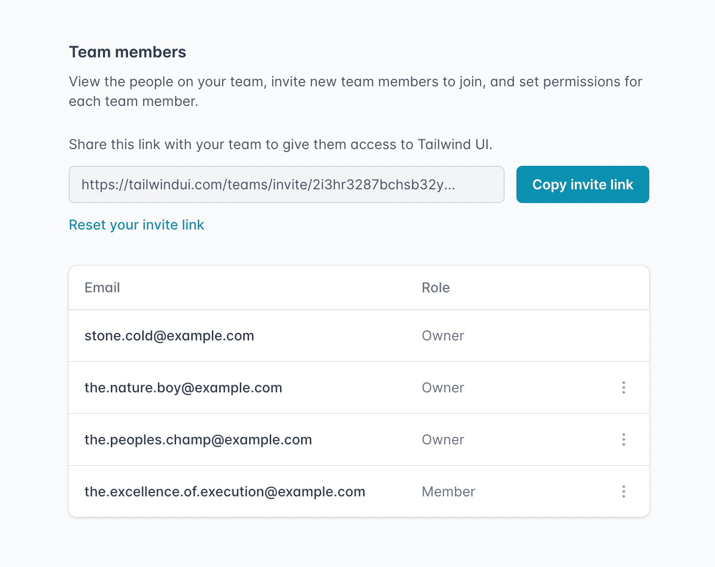
What we landed on was a purely link-based invitation system, where you could just copy your invite link, share it with your team in Slack/Discord/whatever, and reset your link if needed. You can also give people either "Member" or "Owner" permissions, which control whether they can manage team members or view billing history.
This makes it super easy to invite your team without a bunch of tedious data entry, and revoke access if someone leaves right in the UI instead of by changing your shared password.
This is available now for anyone with a Tailwind UI team account — just open the dropdown menu and click "My Team" to name your team and start inviting your co-workers.
You can purchase a license for your team on the Tailwind UI website, or upgrade to a team license if you have a personal license and want to start using Tailwind UI with your team.
Updating the Vue examples in Tailwind UI to <script setup>
Since releasing Vue support for Tailwind UI, the new <script setup> syntax in Vue 3 has become the recommended way to write your single-file components.
We've updated all of the Vue examples in Tailwind UI to use this new format, which cuts out a ton of boilerplate:
<template> <Listbox as="div" v-model="selected"> <!-- ... --> </Listbox></template><script setup> import { ref } from "vue"; import { Listbox, ListboxButton, ListboxLabel, ListboxOption, ListboxOptions } from "@headlessui/vue"; import { CheckIcon, SelectorIcon } from "@heroicons/vue/solid"; const people = [ { id: 1, name: "Wade Cooper" }, // ... ]; const selected = ref(people[3]);</script>To me, the absolute best part is that you don't have to explicitly register anything under components anymore — any components that are in scope are automatically available to the template.
Using <script setup> also lets you use namespaced components like Listbox.Button like we do in the React flavor of Headless UI. We haven't updated Headless UI to expose the components this way yet, but we're probably going to do it soon, which will let you shave off a ton of imports.
New Tailwind CSS language mode for VS Code
Tailwind uses a bunch of non-standard at-rules like @tailwind and @apply, so you get lint warnings in VS Code if you use the regular CSS language mode.
To get around this, we've always recommended people use the PostCSS Language Support plugin, which gets rid of those warnings but also removes all of the other CSS IntelliSense support.
So a few weeks ago, we released a first-party Tailwind CSS language mode as part of our Tailwind CSS IntelliSense extension, which builds on the built-in CSS language mode to add Tailwind-specific syntax highlighting and fix the lint warnings you'd usually see, without losing any of CSS IntelliSense features you do want to keep.
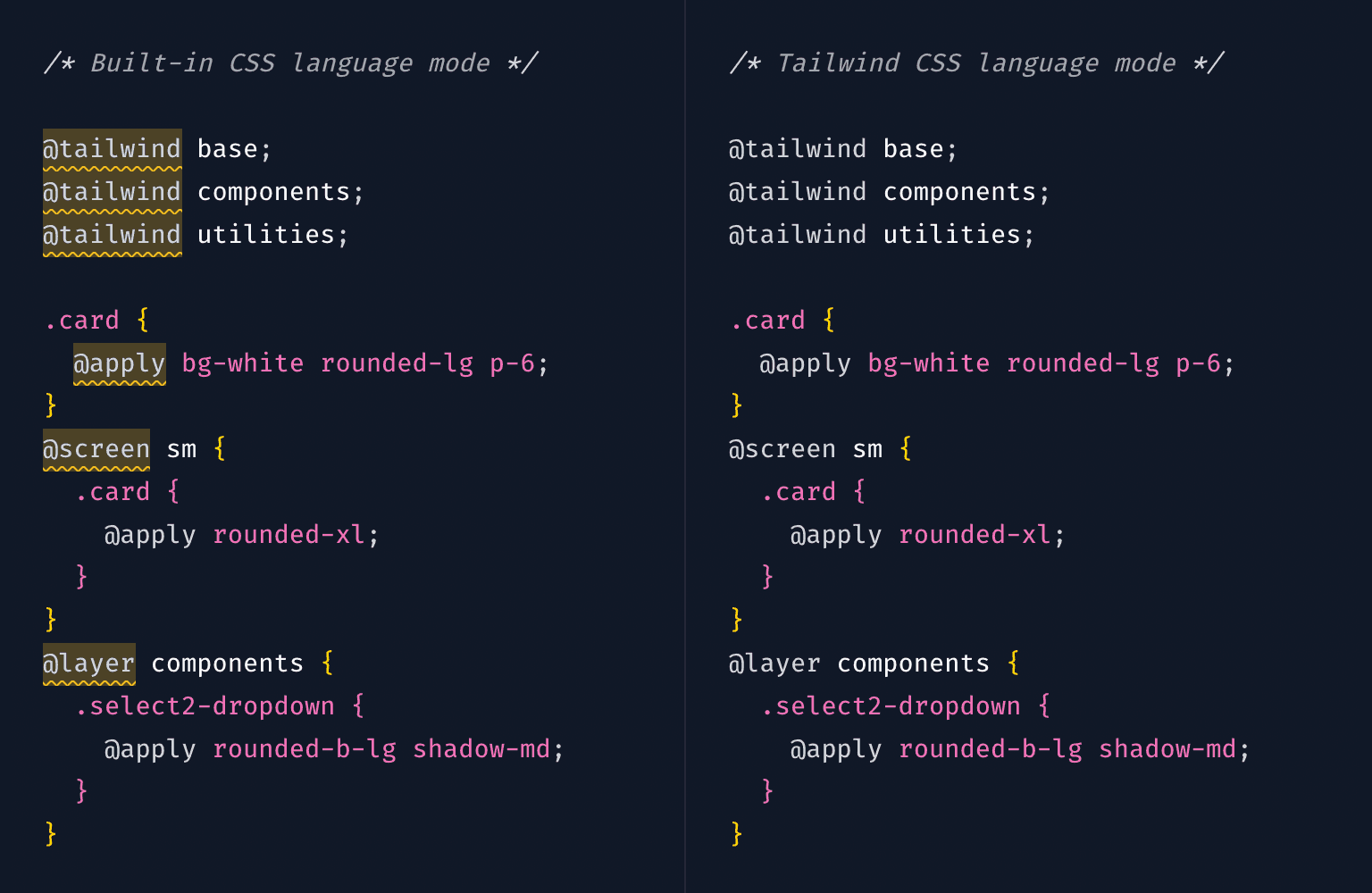
Try it out by downloading the latest version of Tailwind CSS IntelliSense and choosing "Tailwind CSS" as the language mode for your CSS files.
“Generated CSS” panel in Tailwind Play
We've made a bunch of little improvements to Tailwind Play over the last couple of months, with my favorite being the new "Generated CSS" panel.
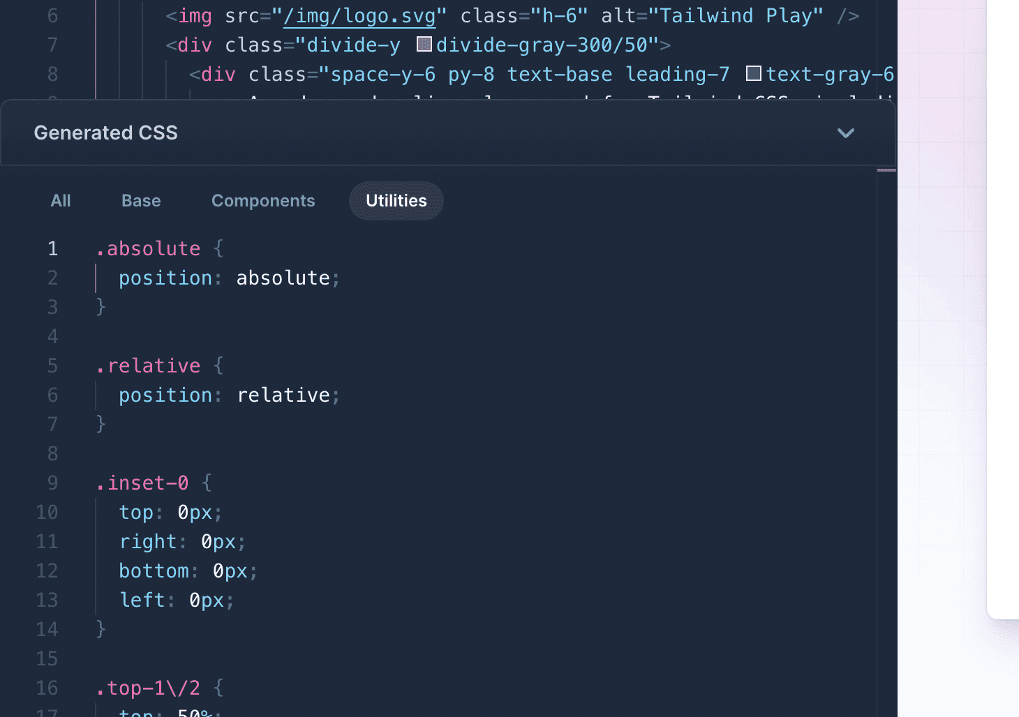
It shows you all of the CSS that was generated from your HTML and lets you filter by layer, which is incredibly useful for troubleshooting. Internally, we are using this all the time to debug weird issues around classes not being detected so we can perform whatever horrific regex surgery is necessary to make it work.
We also added a "Tidy" button (Cmd + S) to each pane that will automatically format your code (and sort your classes!) and a "Copy" button (Cmd + A Cmd + C, but you already know that) too.
Redesigning the Refactoring UI website
When we released Refactoring UI back in December 2018, Steve and I literally designed and built the final landing page the night before launch at like 1am.
What happened is we had this whole sexy landing page designed, then I was writing up the announcement email to send to everyone on our mailing list and we both thought "man the content in this email is great and a lot more compelling than what we have in this landing page design".
But that content didn't really fit into what we had designed, so at the eleventh hour we scrapped everything we had designed and whipped together a much simpler page based on the new content. It looked fine but it wasn't the super beautiful experience we really wanted it to be.
So a few weeks ago, we decided to finally design something new.
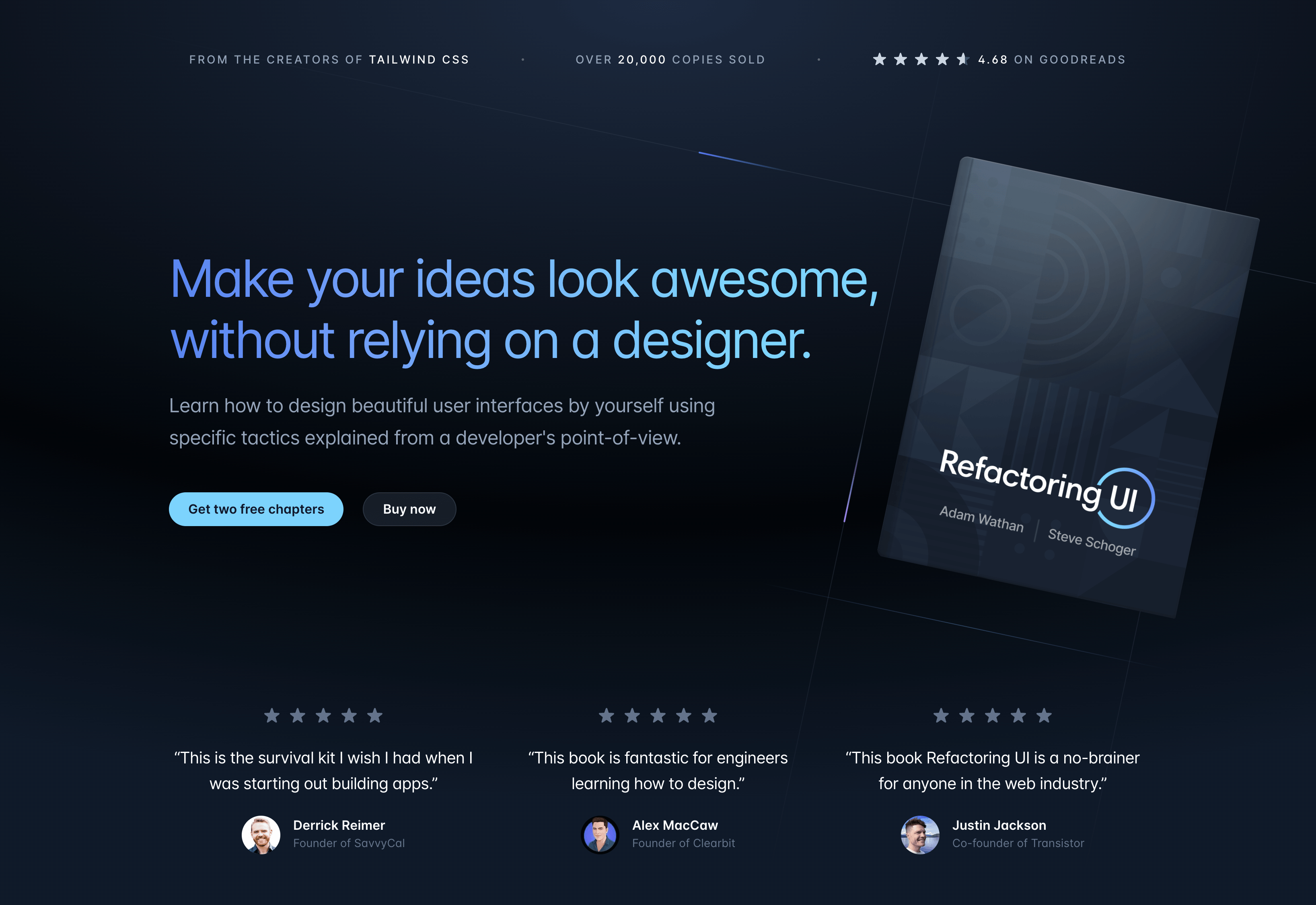
I'm still extremely proud of this book — probably more so than anything we've ever made. It's got a 4.68 rating on Goodreads with over 1100 ratings and almost 200 reviews, which feels pretty incredible to me for a self-published ebook.
Looking forward to doing a second edition one day with everything we've learned since!
Tailwind CSS templates are coming soon
We've teased this a bit on Twitter, but for the last couple of months we've been working really hard on a bunch of full-fledged Tailwind CSS website templates.
Here's a sneak peek at one of them — a documentation site template built with Next.js and Stripe's new Markdoc library:
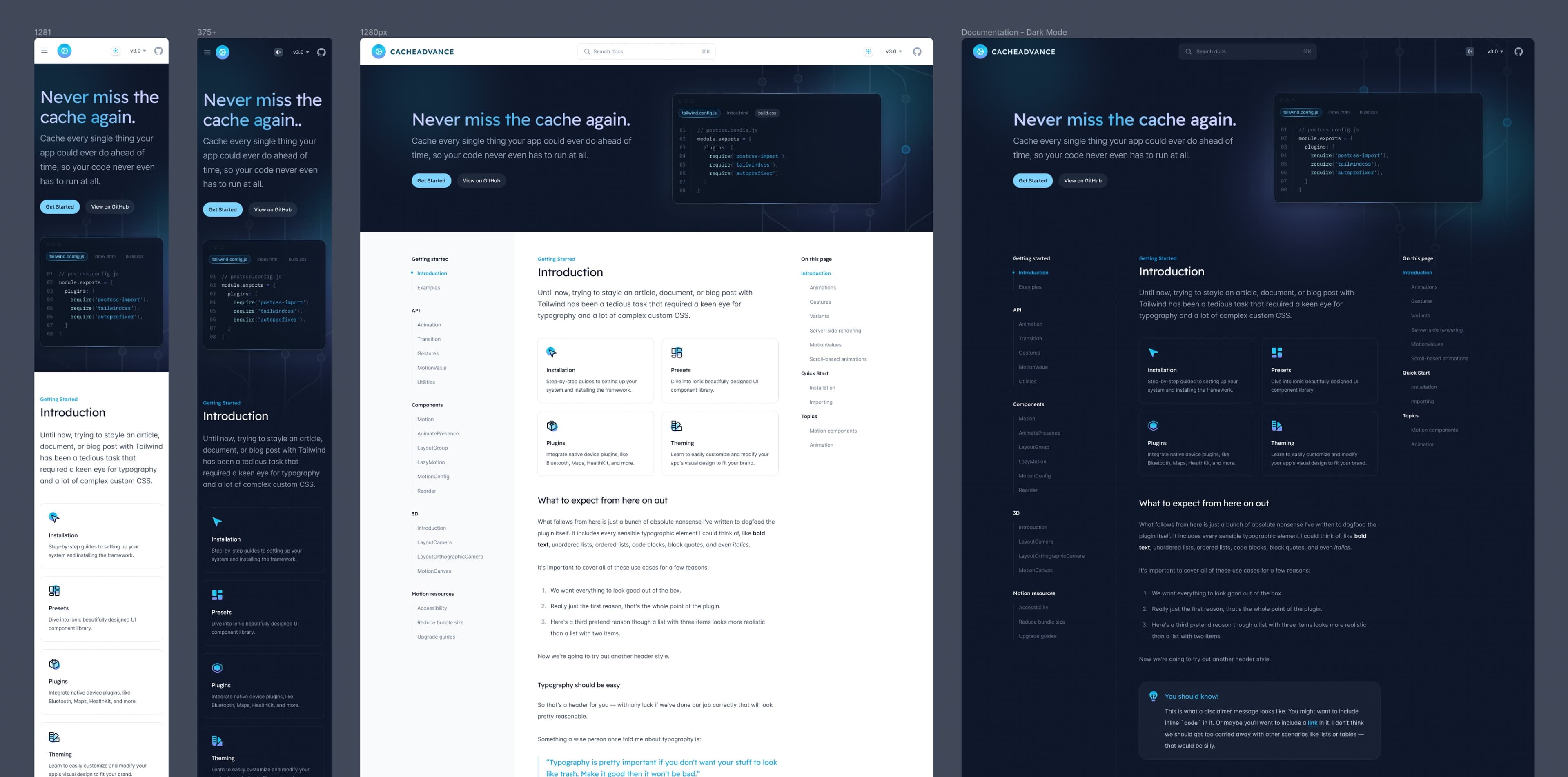
I'm unreasonably excited about getting these out. I'm really proud of Tailwind UI as a product, but one of the limitations of the copy-and-pasteable-code-snippet format is that we don't get an opportunity to really show you how to componentize things, minimize duplication, and architect things as a complete, production-ready website.
The templates we're working on now are going to be amazing at filling that gap. On top of just getting beautiful templates to use as a starting point for your own projects, you'll be able to dig through the code and study exactly how we build websites with Tailwind CSS ourselves.
We haven't set an exact release date on these yet but we're hoping to have something out next month. Will share more as we make more progress!